# Dashimo (PSWriteHTML) – Charting, Icons and few other changes
A few months ago when I first released Dashimo, I’ve promised that Charts will come. Unfortunately, time passed by, and there were no Charts in sight. It’s not that I didn’t want to deliver, I just wasn’t sure on the way I want to allow charts building. Today after playing with the idea for a while I’ve decided to release essential support for diagrams, with a couple of other fixes. Some of that stuff is already there for longer while I just never announced it. There are probably a lot of other hidden gems you may find if you explore PSWriteHTML or Dashimo.
blog
17 Jun 2019 en
[View images (13)](#pf-content-image-1-0)
A few months ago when I first released **Dashimo,** I've promised that **Charts** will come. Unfortunately, time passed by, and there were no **Charts** in sight. It's not that I didn't want to deliver, I just wasn't sure on the way I want to allow **charts building**. Today after playing with the idea for a while I've decided to release essential support for diagrams, with a couple of other fixes. Some of that stuff is already there for longer while I just never announced it. There are probably a lot of other hidden gems you may find if you explore **PSWriteHTML** or **Dashimo**. Before I go into details of this release I wanted to say **Big Thank You** to people that take time to submit issues and even bigger thanks to those doing Pull Requests. It really means a lot. You can now thank [**Ferdi Weiner**](https://github.com/ferwe) who added the ability to **Sort** by **DateTime** in Table.
### 💡 Dashimo – What is it?
If you don't know what **Dashimo** is, I encourage you to take a moment and read both articles below. It will make sense, and I won't have to repeat myself trying to explain basics. It's effortless and intuitive but still worth a read.
- **[Meet Dashimo – PowerShell Generated Dashboard](https://evotec.xyz/meet-dashimo-powershell-generated-dashboard/)**
- **[Dashimo – Easy Table Conditional Formatting and more](https://evotec.xyz/dashimo-easy-table-conditional-formatting-and-more/)**
What you should also know is that **Dashimo** uses a bit different naming convention then your standard **PowerShell Modules** do. If you don't like that convention feel free to use **PSWriteHTML**. PSWriteHTML is what powers **Dashimo** and few other modules such as **[Statusimo,](https://evotec.xyz/meet-statusimo-powershell-generated-status-page/)** **[Emailimo](https://evotec.xyz/meet-emailimo-new-way-to-send-pretty-emails-with-powershell/)** or **[Out-HTMLView](https://evotec.xyz/out-htmlview-html-alternative-to-out-gridview/)** and is responsible for providing me friendly interface for building **HTML**/**CSS** and **JavaScript. **If you want to dig down into sources and find out what powers Dashimo, you need to do that in **PSWriteHTML** repository. Any changes, any fixes go there as well. **Dashimo** is just a concept and something I can type when woken up in the middle of the night.
- **[PSWriteHTML on GitHub](https://github.com/EvotecIT/PSWriteHTML)**
- [**Dashimo on GitHub**](https://github.com/EvotecIT/Dashimo)
What is very important about **Dashimo** or **PSWriteHTML** is that it produces a single **HTML** file. A portable file can be sent via email, opened up from disk or hosted on a website. This makes it easy to use, flexible with lots of features. Best of it – you don't have to know **HTML** at all to produce it. Below you can find four examples hosted on my website. There's nothing fancy about it. Just uploaded **HTML** file and it works. It will behave the same on **IIS** or when run from disk.
- **[Example Dashimo – Line Charts](/wp-content/uploads/2019/06/ExampleChartsLine.html)**
- **[Example Dashimo – Charts Bar](/wp-content/uploads/2019/06/ExampleChartsBar.html)**
- **[Example Dashimo – Charts Mix with Tables](/wp-content/uploads/2019/06/ExampleChartsMix.html)**
- **[Example Dashimo – Tabs](/wp-content/uploads/2019/06/ExampleTabs.html)**
### 💡 Give me charts!
Let's start with a very simple **Bar Chart** example.
```powershell
Dashboard -Name 'Charts - Bar' -FilePath $PSScriptRoot\Output\DashboardChartsBar00.html {
Chart {
ChartLegend -Name 'Time'
ChartBar -Name 'Test' -Value 1
ChartBar -Name 'Test1' -Value 2
ChartBar -Name 'Test2' -Value 3
}
} -Show
```
[!\[Simple Dashimo bar chart with three sample bars\](/wp-content/uploads/2019/06/img_5d068bc3bb68f.png)](/wp-content/uploads/2019/06/img_5d068bc3bb68f.png)
As you see what we did above we simply opened up **Chart**, added **legend**, and three bars. That's what we see on the screen. If you're wondering where is legend… well here it is, showing up when we hover over bars.
[!\[Dashimo bar chart tooltip showing the legend value on hover\](/wp-content/uploads/2019/06/img_5d068e5485426.png)](/wp-content/uploads/2019/06/img_5d068e5485426.png)
This is a very simple scenario, and not really something you will be doing with **Dashimo**. Let's try a bit different example with 4 charts one after another.
```powershell
Import-Module Dashimo -Force
Dashboard -Name 'Charts - Bar' -FilePath $PSScriptRoot\Output\DashboardChartsBar00.html {
Panel {
Chart {
ChartLegend -Name 'Time'
ChartBar -Name 'Test' -Value 1
ChartBar -Name 'Test1' -Value 2
ChartBar -Name 'Test2' -Value 3
}
}
Panel {
Chart {
ChartToolbar -Download
ChartLegend -Name 'Time', 'Money', 'Taxes'
ChartBar -Name 'Test' -Value 1, 2, 3
ChartBar -Name 'Test1' -Value 2, 5, 7
ChartBar -Name 'Test2' -Value 3, 1, 2
}
}
Panel {
Chart {
ChartLegend -Name 'Time'
for ($i = 0; $i -le 5; $i++) {
ChartBar -Name "Test $i" -Value $i
}
}
}
Panel {
Chart {
ChartBarOptions -Vertical -DataLabelsColor GreenYellow
ChartLegend -Name 'Time'
for ($i = 0; $i -le 5; $i++) {
ChartBar -Name "Test $i" -Value $i
}
}
}
} -Show
```
[!\[Four Dashimo bar charts displayed in separate panels\](/wp-content/uploads/2019/06/img_5d068ed466794.png)](/wp-content/uploads/2019/06/img_5d068ed466794.png)
But the power of Dashimo is only visible when you play with Sections. In the next example, I've taken code from above and simply wrapped all four charts into one section. What more I made that section invisible. What do we get?
```powershell
Import-Module Dashimo -Force
Dashboard -Name 'Charts - Bar' -FilePath $PSScriptRoot\DashboardChartsBar00.html {
Section -Invisible {
Panel {
Chart {
ChartLegend -Name 'Time'
ChartBar -Name 'Test' -Value 1
ChartBar -Name 'Test1' -Value 2
ChartBar -Name 'Test2' -Value 3
}
}
Panel {
Chart {
ChartToolbar -Download
ChartLegend -Name 'Time', 'Money', 'Taxes'
ChartBar -Name 'Test' -Value 1, 2, 3
ChartBar -Name 'Test1' -Value 2, 5, 7
ChartBar -Name 'Test2' -Value 3, 1, 2
}
}
Panel {
Chart {
ChartLegend -Name 'Time'
for ($i = 0; $i -le 5; $i++) {
ChartBar -Name "Test $i" -Value $i
}
}
}
Panel {
Chart {
ChartBarOptions -Vertical -DataLabelsColor GreenYellow
ChartLegend -Name 'Time'
for ($i = 0; $i -le 5; $i++) {
ChartBar -Name "Test $i" -Value $i
}
}
}
}
} -Show
```
[!\[Four responsive Dashimo charts displayed side by side in one section\](/wp-content/uploads/2019/06/img_5d068f65174af.png)](/wp-content/uploads/2019/06/img_5d068f65174af.png)
We get four charts next to each other. Nice right? They are fully responsive, so when you scale, they will be larger or smaller. You should also notice there is **ChartToolbar** command. This command allows you to enable more features to Charts, such as the ability to download them as **SVG** or **PNG**. The best thing about this is that there is no single **HTML** or **CSS** or **JS** knowledge required to build that.
### 💡 Mixing charts and tables
Let's not forget about all the other features we already had. **Dashimo** is famous (at least 5 people are using it! – that has to count right?) for its the ability to play with nice with **Tables**. Below code simply takes **charts** and expands it with some table along with with **table conditional formatting**.
```powershell
Import-Module Dashimo -Force
$Process = Get-Process | Select-Object -First 30
Dashboard -Name 'Charts - Bar' -FilePath $PSScriptRoot\Output\DashboardChartsBar00.html {
Section -Invisible {
Panel {
Chart {
ChartLegend -Name 'Time'
ChartBar -Name 'Test' -Value 1
ChartBar -Name 'Test1' -Value 2
ChartBar -Name 'Test2' -Value 3
}
}
Panel {
Chart {
ChartToolbar -Download
ChartLegend -Name 'Time', 'Money', 'Taxes'
ChartBar -Name 'Test' -Value 1, 2, 3
ChartBar -Name 'Test1' -Value 2, 5, 7
ChartBar -Name 'Test2' -Value 3, 1, 2
}
}
Panel {
Chart {
ChartLegend -Name 'Time'
for ($i = 0; $i -le 5; $i++) {
ChartBar -Name "Test $i" -Value $i
}
}
}
Panel {
Chart {
ChartBarOptions -Vertical -DataLabelsColor GreenYellow
ChartLegend -Name 'Time'
for ($i = 0; $i -le 5; $i++) {
ChartBar -Name "Test $i" -Value $i
}
}
}
}
Section -Invisible {
Table -DataTable $Process -HideFooter {
TableConditionalFormatting -Name 'ID' -ComparisonType number -Operator gt -Value 10000 -Color BlueViolet -Row
TableConditionalFormatting -Name 'Name' -ComparisonType string -Operator eq -Value 'chrome' -Color White -BackgroundColor Crimson -Row
TableConditionalFormatting -Name 'PriorityClass' -ComparisonType string -Operator eq -Value 'Idle' -Color White -BackgroundColor Green
}
}
} -Show
```
[!\[Dashimo dashboard combining bar charts with a conditionally formatted process table\](/wp-content/uploads/2019/06/img_5d06902f9a2bc.png)](/wp-content/uploads/2019/06/img_5d06902f9a2bc.png)
What's important here is that **Conditional Table**** Formatting** works on **JS** level. It means **PowerShell** doesn't take time to generate it. It happens when you open **Chrome** or **Firefox** and is processed during runtime. Of course, Panel's can also take Invisible parameter, so you don't need to see those shadows if you don't want to. So not only now you can display **Table**, download it to **Excel**, **CSV**, **PDF**, but also connect with charts. Cool right?
### 💡 Additional table options with some chart settings
Now, let's take one more step, shall we? We're going to add **line charts**, make **panels invisible**, add **table** next to **charts** and also change **PDF output settings**. That's not all, I've also changed paging options so that only seven** elements** are visible in the table in the right down corner. And the full code above generated in more or less 3 seconds.
```powershell
Import-Module Dashimo -Force
$Process = Get-Process | Select-Object -First 30
Dashboard -Name 'Charts - Bar' -FilePath $PSScriptRoot\Output\DashboardChartsBar00.html {
Section -Invisible {
Panel -Invisible {
Chart {
ChartLegend -Name 'Time'
ChartBar -Name 'Test' -Value 1
ChartBar -Name 'Test1' -Value 2
ChartBar -Name 'Test2' -Value 3
}
}
Panel -Invisible {
Chart {
ChartToolbar -Download
ChartLegend -Name 'Time', 'Money', 'Taxes'
ChartBar -Name 'Test' -Value 1, 2, 3
ChartBar -Name 'Test1' -Value 2, 5, 7
ChartBar -Name 'Test2' -Value 3, 1, 2
}
}
Panel -Invisible {
Chart {
ChartLegend -Name 'Time'
for ($i = 0; $i -le 5; $i++) {
ChartBar -Name "Test $i" -Value $i
}
}
}
Panel -Invisible {
Chart {
ChartBarOptions -Vertical -DataLabelsColor GreenYellow
ChartLegend -Name 'Time'
for ($i = 0; $i -le 5; $i++) {
ChartBar -Name "Test $i" -Value $i
}
}
}
}
Section -Invisible {
Table -DataTable $Process -HideFooter {
TableConditionalFormatting -Name 'ID' -ComparisonType number -Operator gt -Value 10000 -Color BlueViolet -Row
TableConditionalFormatting -Name 'Name' -ComparisonType string -Operator eq -Value 'chrome' -Color White -BackgroundColor Crimson -Row
TableConditionalFormatting -Name 'PriorityClass' -ComparisonType string -Operator eq -Value 'Idle' -Color White -BackgroundColor Green
}
}
Section -Invisible {
Panel -Invisible {
Chart -Title 'Incidents Reported vs Solved' -TitleAlignment center {
ChartAxisX -Name 'Jan', 'Feb', 'Mar', 'Apr', 'May', 'Jun', 'Jul', 'Aug', 'Sep'
ChartLine -Name 'Incidents per month' -Value 10, 41, 35, 51, 49, 62, 69, 91, 148
ChartLine -Name 'Incidents per month resolved' -Value 5, 10, 20, 31, 49, 62, 69, 91, 148
}
}
Panel -Invisible {
Chart -Title 'Incidents Reported vs Solved' -TitleAlignment center {
ChartAxisX -Name 'Jan', 'Feb', 'Mar', 'Apr', 'May', 'Jun', 'Jul', 'Aug', 'Sep'
ChartLine -Name 'Incidents per month' -Value 10, 41, 35, 51, 49, 62, 69, 91, 148 -Color Red -Cap square -Dash 5
ChartLine -Name 'Incidents per month resolved' -Value 5, 10, 20, 31, 49, 62, 69, 91, 148 -Color Green -Curve stepline -Width 10
}
}
Panel -Invisible {
Table -DataTable $Process -Filtering -FilteringLocation Bottom -PagingOptions 7, 14 {
TableButtonExcel
TableButtonPDF -Title 'Test' -PageSize A4 -Orientation landscape
TableButtonPageLength
TableConditionalFormatting -Name 'ID' -ComparisonType number -Operator gt -Value 10000 -Color BlueViolet -Row
TableConditionalFormatting -Name 'Name' -ComparisonType string -Operator eq -Value 'chrome' -Color White -BackgroundColor Crimson -Row
TableConditionalFormatting -Name 'PriorityClass' -ComparisonType string -Operator eq -Value 'Idle' -Color White -BackgroundColor Green
}
}
}
} -Show
```
[!\[Dashimo dashboard with line charts, table filtering, and PDF export options\](/wp-content/uploads/2019/06/img_5d069679bc4ad.png)](/wp-content/uploads/2019/06/img_5d069679bc4ad.png)
Keep in mind that I'm only showing here just a handful of options and not a full scope of it. All commands have lots of different parameters allowing you to **customize charts**, tables as you want – adding **colors**, changing how they look, and so on. Have you noticed **filtering** and **search** in a table?
### 💡 Additional table options with some chart settings
While working on the new version I've fixed a handful of bugs, but also added a couple of more features expanding current functionality. Some of you asked if they change tab colors, or change tab icon. You see when I originally planned tabs I wanted to support multiple icons and lots of options, but since I tend to get distracted a lot with fancy new projects adding some things take time. That basically meant you would be stuck with **Bomb** icon in **Tabs**. It's not a big deal, but it wasn't really nice. Each tab having the same icon. Who would want that? Well, not me. So what I did? I've changed a few things and now you can control **Tabs** and choose one of **1400 icons**.
[!\[Dashimo-InAction\](/wp-content/uploads/2019/06/Dashimo-InAction.gif)](/wp-content/uploads/2019/06/Dashimo-InAction.gif)
As you see above you're now able to make **Tabs slim**,** add icons**, change the **color** of **icon** and **color** of **text** separately, and well a couple of other things.
```powershell
$Process = Get-Process | Select-Object -First 30
Dashboard -Name 'Dashimo Test' -FilePath $PSScriptRoot\Output\DashboardEasy10.html -Show {
TabOptions -SlimTabs
Tab -Name 'Test 0' -IconSolid user-alt -IconColor Green {
Table -DataTable $Process -HideFooter {
TableButtonExcel
TableButtonPageLength
TableConditionalFormatting -Name 'ID' -ComparisonType number -Operator gt -Value 10000 -Color BlueViolet -Row
TableConditionalFormatting -Name 'Name' -ComparisonType string -Operator eq -Value 'chrome' -Color White -BackgroundColor Crimson -Row
TableConditionalFormatting -Name 'PriorityClass' -ComparisonType string -Operator eq -Value 'Idle' -Color White -BackgroundColor Green
}
}
Tab -Name 'Test 1' -IconBrands adobe {
Section -Name 'Test' -Collapsable {
Table -DataTable $Process -HideFooter {
TableConditionalFormatting -Name 'ID' -ComparisonType number -Operator gt -Value 10000 -Color BlueViolet -Row
TableConditionalFormatting -Name 'Name' -ComparisonType string -Operator eq -Value 'chrome' -Color White -BackgroundColor Crimson -Row
TableConditionalFormatting -Name 'PriorityClass' -ComparisonType string -Operator eq -Value 'Idle' -Color White -BackgroundColor Green
}
}
}
Tab -Name 'Test 2' -IconRegular clone -TextColor Gold -IconColor MediumPurple {
Section -Name 'Test' -Collapsable {
Table -DataTable $Process -HideFooter {
TableConditionalFormatting -Name 'ID' -ComparisonType number -Operator gt -Value 10000 -Color BlueViolet -Row
TableConditionalFormatting -Name 'Name' -ComparisonType string -Operator eq -Value 'chrome' -Color White -BackgroundColor Crimson -Row
TableConditionalFormatting -Name 'PriorityClass' -ComparisonType string -Operator eq -Value 'Idle' -Color White -BackgroundColor Green
}
}
}
Tab -Name 'Line Charts' -IconRegular hourglass {
Section -Name 'Line Charts - Test' -Collapsable {
Panel {
Chart -Title 'Incidents Reported vs Solved' -TitleAlignment center {
ChartAxisX -Name 'Jan', 'Feb', 'Mar', 'Apr', 'May', 'Jun', 'Jul', 'Aug', 'Sep'
ChartLine -Name 'Incidents per month' -Value 10, 41, 35, 51, 49, 62, 69, 91, 148
ChartLine -Name 'Incidents per month resolved' -Value 5, 10, 20, 31, 49, 62, 69, 91, 148
}
}
Panel {
Chart -Title 'Incidents Reported vs Solved' -TitleAlignment center {
ChartAxisX -Name 'Jan', 'Feb', 'Mar', 'Apr', 'May', 'Jun', 'Jul', 'Aug', 'Sep'
ChartLine -Name 'Incidents per month' -Value 10, 41, 35, 51, 49, 62, 69, 91, 148 -Color Red -Cap square -Dash 5
ChartLine -Name 'Incidents per month resolved' -Value 5, 10, 20, 31, 49, 62, 69, 91, 148 -Color Green -Curve stepline -Width 10
}
}
}
Section -Name 'Line Charts - Test' -Collapsable {
Panel {
Chart -Title 'Product Trends by Month' -TitleAlignment center {
ChartAxisX -Name 'Jan', 'Feb', 'Mar', 'Apr', 'May', 'Jun', 'Jul', 'Aug', 'Sep'
ChartLine -Name 'Desktop' -Value 10, 41, 35, 51, 49, 62, 69, 91, 148
}
}
Panel {
Chart -Title 'Average High & Low Temperature' -TitleAlignment left {
ChartAxisX -Name 'Jan', 'Feb', 'Mar', 'Apr', 'May', 'Jun', 'Jul'
ChartLine -Name "High - 2013" -Value 28, 29, 33, 36, 32, 32, 33 #-Color Red -Cap square -Dash 5
ChartLine -Name "Low - 2013" -Value 12, 11, 14, 18, 17, 13, 13 #-Color Green -Curve stepline -Width 10
}
}
}
Section -Name 'Line Charts - Test' -Collapsable {
Panel {
Chart -Title 'Product Trends by Month' -TitleAlignment center {
ChartAxisX -Name 'Jan', 'Feb', 'Mar', 'Apr', 'May', 'Jun', 'Jul', 'Aug', 'Sep'
ChartLine -Name 'Desktop' -Value 10, 41, 35, 51, 49, 62, 69, 91, 148
}
}
Panel {
Chart -Title 'Average High & Low Temperature' -TitleAlignment left {
ChartAxisX -Name 'Jan', 'Feb', 'Mar', 'Apr', 'May', 'Jun', 'Jul'
ChartLine -Name "High - 2013" -Value 28, 29, 33, 36, 32, 32, 33 -Color Red -Cap square -Dash 5
ChartLine -Name "Low - 2013" -Value 12, 11, 14, 18, 17, 13, 13 -Color BlueViolet
}
}
}
Section -Name 'Line Charts - Test' -Collapsable {
Panel {
Chart -Title 'Product Trends by Month' -TitleAlignment center {
ChartAxisX -Name 'Jan', 'Feb', 'Mar', 'Apr', 'May', 'Jun', 'Jul', 'Aug', 'Sep'
ChartLine -Name 'Desktop' -Value 10, 41, 35, 51, 49, 62, 69, 91, 148 -Curve stepline -Width 10
}
}
Panel {
Chart -Title 'Average High & Low Temperature' -TitleAlignment left {
# This controls how the grid looks like
ChartGrid -Show -Position front -xAxisLinesShow -StrokeDash 5 -RowColors Aquamarine, DarkCyan
# This is category (responsible for values on axis X)
ChartAxisX -Name 'Jan', 'Feb', 'Mar', 'Apr', 'May', 'Jun', 'Jul' -TitleText 'Month'
ChartAxisY -TitleText 'Temperature' -Show -ShowAlways
# Data and control of data
ChartLine -Name "High - 2013" -Value 28, 29, 33, 36, 32, 32, 33 -Curve smooth #-Color Red -Cap square -Dash 5
ChartLine -Name "Low - 2013" -Value 12, 11, 14, 18, 17, 13, 13 -Curve smooth #-Color Green -Curve stepline -Width 10
}
}
}
}
}
```
### 💡 Bar Charts – Different options
Below you can find the code to show you different ways to build **Bar Charts**
```powershell
Import-Module Dashimo -Force
Dashboard -Name 'Charts - Bar' -FilePath $PSScriptRoot\Output\DashboardChartsBar.html {
TabOptions -SlimTabs
Tab -Name 'Bar Charts - Bar' -IconRegular chart-bar {
Section -Name 'Bar Charts - Test' -Collapsable {
Panel {
Chart {
ChartLegend -Name 'Time'
ChartBar -Name 'Test' -Value 1
ChartBar -Name 'Test1' -Value 2
ChartBar -Name 'Test2' -Value 3
}
}
Panel {
Chart {
ChartToolbar -Download
ChartLegend -Name 'Time', 'Money', 'Taxes'
ChartBar -Name 'Test' -Value 1, 2, 3
ChartBar -Name 'Test1' -Value 2, 5, 7
ChartBar -Name 'Test2' -Value 3, 1, 2
}
}
Panel {
Chart {
ChartLegend -Name 'Time'
for ($i = 0; $i -le 5; $i++) {
ChartBar -Name "Test $i" -Value $i
}
}
}
Panel {
Chart {
ChartBarOptions -Vertical -DataLabelsColor GreenYellow
ChartLegend -Name 'Time'
for ($i = 0; $i -le 5; $i++) {
ChartBar -Name "Test $i" -Value $i
}
}
}
}
Section -Name 'Bar Charts - Test Colors' -Collapsable {
Panel -Invisible {
Chart {
ChartLegend -Name 'Time'
ChartBar -Name 'Test' -Value 1
ChartBar -Name 'Test1' -Value 2
ChartBar -Name 'Test2' -Value 3
}
}
Panel -Invisible {
Chart {
ChartLegend -Name 'Time', 'Money', 'Taxes'
ChartBar -Name 'Test' -Value 1, 2, 3
ChartBar -Name 'Test1' -Value 2, 5, 7
ChartBar -Name 'Test2' -Value 3, 1, 2
}
}
Panel -Invisible {
Chart {
ChartLegend -Name 'Time'
for ($i = 0; $i -le 5; $i++) {
ChartBar -Name "Test $i" -Value $i
}
}
}
Panel -Invisible {
Chart {
ChartBarOptions -Vertical -DataLabelsColor GreenYellow
ChartLegend -Name 'Time'
for ($i = 0; $i -le 5; $i++) {
ChartBar -Name "Test $i" -Value $i
}
}
}
}
Section -Name 'Bar Charts - Standard Bar' -Collapsable {
Panel {
$Data1 = 400, 430, 448, 470, 540, 580, 690, 1100, 1200, 1380
$DataNames1 = 'South Korea', 'Canada', 'United Kingdom', 'Netherlands', 'Italy', 'France', 'Japan', 'United States', 'China', 'Germany'
Chart {
ChartLegend -Name 'Number of bottles'
for ($i = 0; $i -lt $Data1.Count; $i++) {
ChartBar -Name $DataNames1[$i] -Value $Data1[$i]
}
}
}
Panel {
$Data1 = 44, 55, 41, 64, 22, 43, 21
$Data2 = 53, 32, 33, 52, 13, 44, 32
$DataNames1 = 2001, 2002, 2003, 2004, 2005, 2006, 2007
Chart -Title 'Born vs Dead' -TitleAlignment center {
#ChartBarOptions
ChartLegend -Name 'Born', 'Died'
for ($i = 0; $i -lt $Data1.Count; $i++) {
ChartBar -Name $DataNames1[$i] -Value $Data1[$i], $Data2[$i]
}
}
}
}
Section -Name 'Bar Charts - Standard Bar Vertical' -Collapsable {
Panel {
$Data1 = 400, 430, 448, 470, 540, 580, 690, 1100, 1200, 1380
$DataNames1 = 'South Korea', 'Canada', 'United Kingdom', 'Netherlands', 'Italy', 'France', 'Japan', 'United States', 'China', 'Germany'
Chart {
ChartBarOptions -Vertical
ChartLegend -Name 'Number of bottles'
for ($i = 0; $i -lt $Data1.Count; $i++) {
ChartBar -Name $DataNames1[$i] -Value $Data1[$i]
}
}
}
Panel {
$Data1 = 44, 55, 41, 64, 22, 43, 21
$Data2 = 53, 32, 33, 52, 13, 44, 32
$DataNames1 = 2001, 2002, 2003, 2004, 2005, 2006, 2007
Chart -Title 'Born vs Dead' -TitleAlignment center {
ChartBarOptions -Vertical
ChartLegend -Name 'Born', 'Died'
for ($i = 0; $i -lt $Data1.Count; $i++) {
ChartBar -Name $DataNames1[$i] -Value $Data1[$i], $Data2[$i]
}
}
}
}
Section -Name 'Bar Charts - Standard Bar Vertical & Patterned' -Collapsable {
Panel {
$Data1 = 400, 430, 448, 470, 540, 580, 690, 1100, 1200, 1380
$DataNames1 = 'South Korea', 'Canada', 'United Kingdom', 'Netherlands', 'Italy', 'France', 'Japan', 'United States', 'China', 'Germany'
Chart {
ChartBarOptions -Vertical -Patterned
ChartLegend -Name 'Number of bottles'
for ($i = 0; $i -lt $Data1.Count; $i++) {
ChartBar -Name $DataNames1[$i] -Value $Data1[$i]
}
}
}
Panel {
$Data1 = 44, 55, 41, 64, 22, 43, 21
$Data2 = 53, 32, 33, 52, 13, 44, 32
$DataNames1 = 2001, 2002, 2003, 2004, 2005, 2006, 2007
Chart -Title 'Born vs Dead' -TitleAlignment center {
ChartBarOptions -Vertical -Patterned
ChartLegend -Name 'Born', 'Died'
for ($i = 0; $i -lt $Data1.Count; $i++) {
ChartBar -Name $DataNames1[$i] -Value $Data1[$i], $Data2[$i]
}
}
}
}
}
Tab -Name 'Bar Charts - Bar Stacked' -IconRegular chart-bar {
Section -Name 'Bar Charts 1 - Bar Stacked' -Collapsable {
# One way to build charts but with 2 values
Panel {
$Data1 = 400, 430, 448, 470, 540, 580, 690, 1100, 1200, 1380
$Data2 = 44, 55, 41, 64, 22, 43, 21
$Data3 = 53, 32, 33, 52, 13, 44, 32
$DataNames1 = 'South Korea', 'Canada', 'United Kingdom', 'Netherlands', 'Italy', 'France', 'Japan', 'United States', 'China', 'Germany'
Chart {
ChartBarOptions -Type barStacked
ChartLegend -Name 'People', 'Pets', 'Furniture'
for ($i = 0; $i -lt $Data1.Count; $i++) {
ChartBar -Name $DataNames1[$i] -Value $Data1[$i], $Data2[$i], $Data3[$i]
}
}
}
Panel {
$DataNames1 = 2001, 2002, 2003, 2004, 2005, 2006, 2007
Chart -Title 'Pets vs People' -TitleAlignment center {
ChartBarOptions -Type barStacked
ChartLegend -Name 'People', 'Pets'
ChartBar -Name $DataNames1[0] -Value 44, 53
ChartBar -Name $DataNames1[1] -Value 55, 32
ChartBar -Name $DataNames1[2] -Value 41, 33
ChartBar -Name $DataNames1[3] -Value 64, 52
ChartBar -Name $DataNames1[4] -Value 22, 13
ChartBar -Name $DataNames1[5] -Value 43, 44
ChartBar -Name $DataNames1[6] -Value 21, 32
}
}
}
}
Tab -Name 'Bar Charts - Bar Stacked 100%' -IconSolid audio-description {
Section -Name 'Bar Charts - Stacked 100%' -Collapsable {
Panel {
$Data1 = 44, 55, 41, 37, 22, 43, 21
$Data2 = 53, 32, 33, 52, 13, 43, 32
$Data3 = 12, 17, 11, 9, 15, 11, 20
$Data4 = 9, 7, 5, 8, 6, 9, 4
$Data5 = 25, 12, 19, 32, 25, 24, 10
$DataNames1 = 2008, 2009, 2010, 2011, 2012, 2013, 2014
Chart -Title 'Finctional Books Sales' {
ChartBarOptions -Type barStacked100Percent
ChartLegend -Names 'Marine Sprite', 'Striking Calf', 'Tank Picture', 'Tank Picture', 'Bucket Slope', 'Reborn Kid', 'Other' -LegendPosition top
for ($i = 0; $i -lt $Data1.Count; $i++) {
ChartBar -Name $DataNames1[$i] -Value $Data1[$i], $Data2[$i], $Data3[$i], $Data4[$i], $Data5[$i]
}
}
}
Panel {
$Data1 = 44, 55, 41, 64, 22, 43, 21
$Data2 = 53, 32, 33, 52, 13, 44, 32
$DataNames1 = 2001, 2002, 2003, 2004, 2005, 2006, 2007
Chart -Title 'Pets vs People' -TitleAlignment center {
ChartBarOptions -Type barStacked100Percent
ChartLegend -Names 'People', 'Pets' -LegendPosition bottom
for ($i = 0; $i -lt $Data1.Count; $i++) {
ChartBar -Name $DataNames1[$i] -Value $Data1[$i], $Data2[$i]
}
}
}
}
}
Tab -Name 'Bar Charts - Bar Stacked Plus/Minus' -IconRegular file {
Section -Name 'Bar Charts - Stacked 100%' -Collapsable {
Panel {
$Data1 = -0.8, -1.05, -1.06, -1.18, -1.4, -2.2, -2.85, -3.7, -3.96, -4.22, -4.3, -4.4, -4.1, -4, -4.1, -3.4, -3.1, -2.8
$Data2 = 0.4, 0.65, 0.76, 0.88, 1.5, 2.1, 2.9, 3.8, 3.9, 4.2, 4, 4.3, 4.1, 4.2, 4.5, 3.9, 3.5, 3
$DataLegend = 'Males', 'Females' # should match amount of data sets
$DataNames = '85+', '80-84', '75-79', '70-74', '65-69', '60-64', '55-59', '50-54', '45-49', '40-44', '35-39', '30-34', '25-29', '20-24', '15-19', '10-14', '5-9', '0-4'
Chart -Title 'Mauritius population pyramid 2011' {
ChartBarOptions -Type barStacked
ChartLegend -Names $DataLegend -LegendPosition top
for ($i = 0; $i -lt $Data1.Count; $i++) {
ChartBar -Name $DataNames[$i] -Value $Data1[$i], $Data2[$i]
}
}
#ChartBar -Data $Data1, $Data2 -DataNames $DataNames -DataLegend $DataLegend -Type barStacked -DataLabelsEnabled $true -Height 500
}
Panel {
$Data1 = -0.8, -1.05, -1.06, -1.18, -1.4, -2.2, -2.85, -3.7, -3.96, -4.22, -4.3, -4.4, -4.1, -4, -4.1, -3.4, -3.1, -2.8
$Data2 = 0.4, 0.65, 0.76, 0.88, 1.5, 2.1, 2.9, 3.8, 3.9, 4.2, 4, 4.3, 4.1, 4.2, 4.5, 3.9, 3.5, 3
$DataLegend = 'Males', 'Females' # should match amount of data sets
$DataNames = '85+', '80-84', '75-79', '70-74', '65-69', '60-64', '55-59', '50-54', '45-49', '40-44', '35-39', '30-34', '25-29', '20-24', '15-19', '10-14', '5-9', '0-4'
Chart -Title 'Mauritius population pyramid 2011' {
ChartBarOptions -Type barStacked -Vertical
ChartLegend -Names $DataLegend -LegendPosition top
for ($i = 0; $i -lt $Data1.Count; $i++) {
ChartBar -Name $DataNames[$i] -Value $Data1[$i], $Data2[$i]
}
}
}
}
}
} -Show
```
And here's how it will look like
[YouTube video](https://www.youtube.com/embed/Sa114mOoZX4)
### 💡 Line Charts – Different options
The same approach applies to line charts. Below you can find some examples on how you can configure charts to match your style.
```powershell
Import-Module Dashimo -Force
Dashboard -Name 'Charts - Line' -FilePath $PSScriptRoot\Output\DashboardChartsLine.html {
TabOptions -SlimTabs
Tab -Name 'Line Charts' -IconRegular hourglass {
Section -Name 'Line Charts - Test' -Collapsable {
Panel {
Chart -Title 'Incidents Reported vs Solved' -TitleAlignment center {
ChartAxisX -Name 'Jan', 'Feb', 'Mar', 'Apr', 'May', 'Jun', 'Jul', 'Aug', 'Sep'
ChartLine -Name 'Incidents per month' -Value 10, 41, 35, 51, 49, 62, 69, 91, 148
ChartLine -Name 'Incidents per month resolved' -Value 5, 10, 20, 31, 49, 62, 69, 91, 148
}
}
Panel {
Chart -Title 'Incidents Reported vs Solved' -TitleAlignment center {
ChartAxisX -Name 'Jan', 'Feb', 'Mar', 'Apr', 'May', 'Jun', 'Jul', 'Aug', 'Sep'
ChartLine -Name 'Incidents per month' -Value 10, 41, 35, 51, 49, 62, 69, 91, 148 -Color Red -Cap square -Dash 5
ChartLine -Name 'Incidents per month resolved' -Value 5, 10, 20, 31, 49, 62, 69, 91, 148 -Color Green -Curve stepline -Width 10
}
}
}
Section -Name 'Line Charts - Test' -Collapsable {
Panel {
Chart -Title 'Product Trends by Month' -TitleAlignment center {
ChartAxisX -Name 'Jan', 'Feb', 'Mar', 'Apr', 'May', 'Jun', 'Jul', 'Aug', 'Sep'
ChartLine -Name 'Desktop' -Value 10, 41, 35, 51, 49, 62, 69, 91, 148
}
}
Panel {
Chart -Title 'Average High & Low Temperature' -TitleAlignment left {
ChartAxisX -Name 'Jan', 'Feb', 'Mar', 'Apr', 'May', 'Jun', 'Jul'
ChartLine -Name "High - 2013" -Value 28, 29, 33, 36, 32, 32, 33 #-Color Red -Cap square -Dash 5
ChartLine -Name "Low - 2013" -Value 12, 11, 14, 18, 17, 13, 13 #-Color Green -Curve stepline -Width 10
}
}
}
Section -Name 'Line Charts - Test' -Collapsable {
Panel {
Chart -Title 'Product Trends by Month' -TitleAlignment center {
ChartAxisX -Name 'Jan', 'Feb', 'Mar', 'Apr', 'May', 'Jun', 'Jul', 'Aug', 'Sep'
ChartLine -Name 'Desktop' -Value 10, 41, 35, 51, 49, 62, 69, 91, 148
}
}
Panel {
Chart -Title 'Average High & Low Temperature' -TitleAlignment left {
ChartAxisX -Name 'Jan', 'Feb', 'Mar', 'Apr', 'May', 'Jun', 'Jul'
ChartLine -Name "High - 2013" -Value 28, 29, 33, 36, 32, 32, 33 -Color Red -Cap square -Dash 5
ChartLine -Name "Low - 2013" -Value 12, 11, 14, 18, 17, 13, 13 -Color BlueViolet
}
}
}
Section -Name 'Line Charts - Test' -Collapsable {
Panel {
Chart -Title 'Product Trends by Month' -TitleAlignment center {
ChartAxisX -Name 'Jan', 'Feb', 'Mar', 'Apr', 'May', 'Jun', 'Jul', 'Aug', 'Sep'
ChartLine -Name 'Desktop' -Value 10, 41, 35, 51, 49, 62, 69, 91, 148 -Curve stepline -Width 10
}
}
Panel {
Chart -Title 'Average High & Low Temperature' -TitleAlignment left {
# This controls how the grid looks like
ChartGrid -Show -Position front -xAxisLinesShow -StrokeDash 5 -RowColors Aquamarine, DarkCyan
# This is category (responsible for values on axis X)
ChartAxisX -Name 'Jan', 'Feb', 'Mar', 'Apr', 'May', 'Jun', 'Jul' -TitleText 'Month'
ChartAxisY -TitleText 'Temperature' -Show -ShowAlways
# Data and control of data
ChartLine -Name "High - 2013" -Value 28, 29, 33, 36, 32, 32, 33 -Curve smooth #-Color Red -Cap square -Dash 5
ChartLine -Name "Low - 2013" -Value 12, 11, 14, 18, 17, 13, 13 -Curve smooth #-Color Green -Curve stepline -Width 10
}
}
}
}
} -Show
```
[!\[Dashimo tabs with Font Awesome icons and colored tab labels\](/wp-content/uploads/2019/06/img_5d069dc2a4855.png)](/wp-content/uploads/2019/06/img_5d069dc2a4855.png)
### 💡 Font awesome icons in Tabs
As mentioned in the begining you can now use one of 1400 icons in tabs. You have three choices. IconRegular, IconSolid, and IconBrands. Below screenshot shows some of them.
[!\[Dashimo tab icon examples using IconRegular, IconSolid, and IconBrands\](/wp-content/uploads/2019/06/img_5d069f46ce99c.png)](/wp-content/uploads/2019/06/img_5d069f46ce99c.png)
You can size those icons, you can size text, you can change colors making it your own. Not only that but you can now control tabs selector color, transition, linear gradient. If you don't use **TabOptions** it will take defaults. But if you're into that kind of customization, be my guest.
[!\[Dashimo tab customization with icon sizes, text colors, and gradient selector styles\](/wp-content/uploads/2019/06/img_5d069fe7f24d8.png)](/wp-content/uploads/2019/06/img_5d069fe7f24d8.png)
### 💡 Paging Option / Paging Length
You can now also control **Page Length **for **Tables**. **Paging options** allow you to define user choices.
[!\[Dashimo table page length menu showing custom paging options\](/wp-content/uploads/2019/06/img_5d0754d085f20.png)](/wp-content/uploads/2019/06/img_5d0754d085f20.png)
It's as simple as defining a new array with proper values.
```powershell
Panel {
Table -DataTable $Process -DisableSearch -HideFooter -PagingOptions @(5, 10)
}
```
### 💡 Controlling Table Buttons
It used to be possible to control availability of export buttons with Buttons parameter. It only allowed customization on what should appear as an export option. No export options would be an empty array, and if you wanted export to excel, csv or others you would need to give all buttons as an array.
```powershell
Panel {
Table -DataTable $Process -Buttons copyHtml5,excelHtml5,pdfHtml5 -DisableSearch -DisablePaging -HideFooter
}
```
```powershell
Panel {
Table -DataTable $Process {
TableButtonPDF -PageSize A10 -Orientation landscape
TableButtonCopy
TableButtonExcel
} -Buttons @() -DisableSearch -DisablePaging -HideFooter
}
```
But it only controlled what shown up. With the new version, you can define buttons separately. The moment you add **TableButtonPDF** command or similar Buttons parameter doesn't matter. For now, only **TableButtonPDF** got multiple options to choose from, and rest of the TableButton commands are mostly there to add a button, but surely I will add more customizations here so one can name the button as he/she wants to. To give you some ideas here's a bunch of options for **TableButtonPDF** customization.
[!\[Dashimo PDF export button options for table output configuration\](/wp-content/uploads/2019/06/img_5d07587de06d0.png)](/wp-content/uploads/2019/06/img_5d07587de06d0.png)
### 💡 Complicated Example
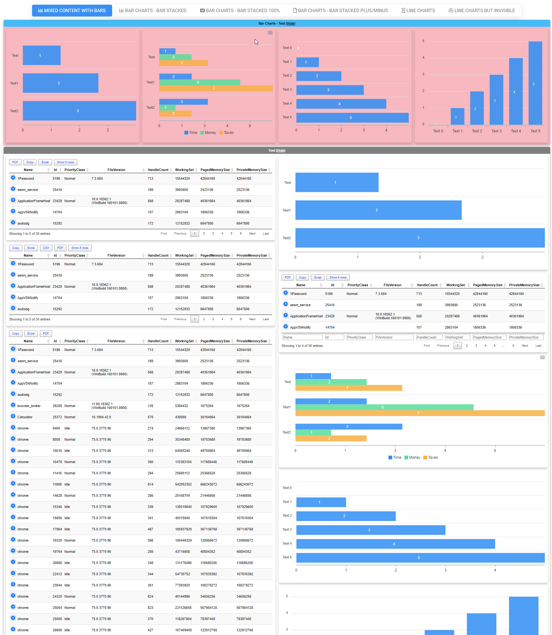
Here's the most complicated example with a lot of features in use. You can find how it looks in the [Dashboard Mixed Content example](/wp-content/uploads/2019/06/DashboardMixedContent.html) or simply run the code yourself.
[!\[Complex Dashimo dashboard example with charts, tables, tabs, and custom styling\](/wp-content/uploads/2019/06/img_5d07698178d57.png)](/wp-content/uploads/2019/06/img_5d07698178d57.png)
```powershell
Import-Module Dashimo -Force
$Process = Get-Process | Select-Object -First 30
Dashboard -Name 'Mixed Content Example' -FilePath $PSScriptRoot\Output\DashboardMixedContent.html {
TabOptions -SlimTabs
Tab -Name 'Mixed content with Bars' -IconRegular chart-bar {
Section -Name 'Bar Charts - Test' -Collapsable -BackgroundColor LightPink -TextColor Black {
Panel {
Chart {
ChartLegend -Name 'Time'
ChartBar -Name 'Test' -Value 1
ChartBar -Name 'Test1' -Value 2
ChartBar -Name 'Test2' -Value 3
}
}
Panel {
Chart {
ChartToolbar -Download
ChartLegend -Name 'Time', 'Money', 'Taxes'
ChartBar -Name 'Test' -Value 1, 2, 3
ChartBar -Name 'Test1' -Value 2, 5, 7
ChartBar -Name 'Test2' -Value 3, 1, 2
}
}
Panel {
Chart {
ChartLegend -Name 'Time'
for ($i = 0; $i -le 5; $i++) {
ChartBar -Name "Test $i" -Value $i
}
}
}
Panel {
Chart {
ChartBarOptions -Vertical -DataLabelsColor GreenYellow
ChartLegend -Name 'Time'
for ($i = 0; $i -le 5; $i++) {
ChartBar -Name "Test $i" -Value $i
}
}
}
}
Section -Name 'Test' -Collapsable -TextBackGroundColor Gray {
Container {
Panel {
Table -DataTable $Process {
TableButtonPDF -
TableButtonCopy
TableButtonExcel
TableButtonPageLength
} -Buttons @() -DisableSearch -PagingOptions @(5, 10) -HideFooter
}
Panel {
Table -DataTable $Process -DisableSearch -HideFooter -PagingOptions @(5, 10)
}
Panel {
Table -DataTable $Process -Buttons copyHtml5, excelHtml5, pdfHtml5 -DisableSearch -DisablePaging
}
}
Container {
Panel {
Chart {
ChartLegend -Name 'Time'
ChartBar -Name 'Test' -Value 1
ChartBar -Name 'Test1' -Value 2
ChartBar -Name 'Test2' -Value 3
}
}
Panel {
Table -DataTable $Process {
TableButtonPDF
TableButtonCopy
TableButtonExcel
TableButtonPageLength
} -DisableSearch -PagingOptions @(4, 8) -Filtering
}
Panel {
Chart {
ChartToolbar -Download
ChartLegend -Name 'Time', 'Money', 'Taxes'
ChartBar -Name 'Test' -Value 1, 2, 3
ChartBar -Name 'Test1' -Value 2, 5, 7
ChartBar -Name 'Test2' -Value 3, 1, 2
}
}
Panel {
Chart {
ChartLegend -Name 'Time'
for ($i = 0; $i -le 5; $i++) {
ChartBar -Name "Test $i" -Value $i
}
}
}
Panel {
Chart {
ChartBarOptions -Vertical -DataLabelsColor GreenYellow
ChartLegend -Name 'Time'
for ($i = 0; $i -le 5; $i++) {
ChartBar -Name "Test $i" -Value $i
}
}
}
}
}
Section -Name 'Bar Charts - Test Colors' -TextColor PaleVioletRed {
Panel -Invisible {
Chart {
ChartLegend -Name 'Time'
ChartBar -Name 'Test' -Value 1
ChartBar -Name 'Test1' -Value 2
ChartBar -Name 'Test2' -Value 3
}
}
Panel -Invisible {
Chart {
ChartLegend -Name 'Time', 'Money', 'Taxes'
ChartBar -Name 'Test' -Value 1, 2, 3
ChartBar -Name 'Test1' -Value 2, 5, 7
ChartBar -Name 'Test2' -Value 3, 1, 2
}
}
Panel -Invisible {
Chart {
ChartLegend -Name 'Time'
for ($i = 0; $i -le 5; $i++) {
ChartBar -Name "Test $i" -Value $i
}
}
}
Panel -Invisible {
Chart {
ChartBarOptions -Vertical -DataLabelsColor GreenYellow
ChartLegend -Name 'Time'
for ($i = 0; $i -le 5; $i++) {
ChartBar -Name "Test $i" -Value $i
}
}
}
}
Section -Name 'Bar Charts - Standard Bar' -Collapsable {
Panel {
$Data1 = 400, 430, 448, 470, 540, 580, 690, 1100, 1200, 1380
$DataNames1 = 'South Korea', 'Canada', 'United Kingdom', 'Netherlands', 'Italy', 'France', 'Japan', 'United States', 'China', 'Germany'
Chart {
ChartLegend -Name 'Number of bottles'
for ($i = 0; $i -lt $Data1.Count; $i++) {
ChartBar -Name $DataNames1[$i] -Value $Data1[$i]
}
}
}
Panel {
$Data1 = 44, 55, 41, 64, 22, 43, 21
$Data2 = 53, 32, 33, 52, 13, 44, 32
$DataNames1 = 2001, 2002, 2003, 2004, 2005, 2006, 2007
Chart -Title 'Born vs Dead' -TitleAlignment center {
#ChartBarOptions
ChartLegend -Name 'Born', 'Died'
for ($i = 0; $i -lt $Data1.Count; $i++) {
ChartBar -Name $DataNames1[$i] -Value $Data1[$i], $Data2[$i]
}
}
}
}
Section -Name 'Bar Charts - Standard Bar Vertical' -Collapsable {
Panel {
$Data1 = 400, 430, 448, 470, 540, 580, 690, 1100, 1200, 1380
$DataNames1 = 'South Korea', 'Canada', 'United Kingdom', 'Netherlands', 'Italy', 'France', 'Japan', 'United States', 'China', 'Germany'
Chart {
ChartBarOptions -Vertical
ChartLegend -Name 'Number of bottles'
for ($i = 0; $i -lt $Data1.Count; $i++) {
ChartBar -Name $DataNames1[$i] -Value $Data1[$i]
}
}
}
Panel {
$Data1 = 44, 55, 41, 64, 22, 43, 21
$Data2 = 53, 32, 33, 52, 13, 44, 32
$DataNames1 = 2001, 2002, 2003, 2004, 2005, 2006, 2007
Chart -Title 'Born vs Dead' -TitleAlignment center {
ChartBarOptions -Vertical
ChartLegend -Name 'Born', 'Died'
for ($i = 0; $i -lt $Data1.Count; $i++) {
ChartBar -Name $DataNames1[$i] -Value $Data1[$i], $Data2[$i]
}
}
}
}
Section -Name 'Bar Charts - Standard Bar Vertical & Patterned' -Collapsable {
Panel {
$Data1 = 400, 430, 448, 470, 540, 580, 690, 1100, 1200, 1380
$DataNames1 = 'South Korea', 'Canada', 'United Kingdom', 'Netherlands', 'Italy', 'France', 'Japan', 'United States', 'China', 'Germany'
Chart {
ChartBarOptions -Vertical -Patterned
ChartLegend -Name 'Number of bottles'
for ($i = 0; $i -lt $Data1.Count; $i++) {
ChartBar -Name $DataNames1[$i] -Value $Data1[$i]
}
}
}
Panel {
$Data1 = 44, 55, 41, 64, 22, 43, 21
$Data2 = 53, 32, 33, 52, 13, 44, 32
$DataNames1 = 2001, 2002, 2003, 2004, 2005, 2006, 2007
Chart -Title 'Born vs Dead' -TitleAlignment center {
ChartBarOptions -Vertical -Patterned
ChartLegend -Name 'Born', 'Died'
for ($i = 0; $i -lt $Data1.Count; $i++) {
ChartBar -Name $DataNames1[$i] -Value $Data1[$i], $Data2[$i]
}
}
}
}
}
Tab -Name 'Bar Charts - Bar Stacked' -IconRegular chart-bar {
Section -Name 'Bar Charts 1 - Bar Stacked' -Collapsable {
# One way to build charts but with 2 values
Panel {
$Data1 = 400, 430, 448, 470, 540, 580, 690, 1100, 1200, 1380
$Data2 = 44, 55, 41, 64, 22, 43, 21
$Data3 = 53, 32, 33, 52, 13, 44, 32
$DataNames1 = 'South Korea', 'Canada', 'United Kingdom', 'Netherlands', 'Italy', 'France', 'Japan', 'United States', 'China', 'Germany'
Chart {
ChartBarOptions -Type barStacked
ChartLegend -Name 'People', 'Pets', 'Furniture'
for ($i = 0; $i -lt $Data1.Count; $i++) {
ChartBar -Name $DataNames1[$i] -Value $Data1[$i], $Data2[$i], $Data3[$i]
}
}
}
Panel {
$DataNames1 = 2001, 2002, 2003, 2004, 2005, 2006, 2007
Chart -Title 'Pets vs People' -TitleAlignment center {
ChartBarOptions -Type barStacked
ChartLegend -Name 'People', 'Pets'
ChartBar -Name $DataNames1[0] -Value 44, 53
ChartBar -Name $DataNames1[1] -Value 55, 32
ChartBar -Name $DataNames1[2] -Value 41, 33
ChartBar -Name $DataNames1[3] -Value 64, 52
ChartBar -Name $DataNames1[4] -Value 22, 13
ChartBar -Name $DataNames1[5] -Value 43, 44
ChartBar -Name $DataNames1[6] -Value 21, 32
}
}
}
}
Tab -Name 'Bar Charts - Bar Stacked 100%' -IconSolid audio-description {
Section -Name 'Bar Charts - Stacked 100%' -Collapsable {
Panel {
$Data1 = 44, 55, 41, 37, 22, 43, 21
$Data2 = 53, 32, 33, 52, 13, 43, 32
$Data3 = 12, 17, 11, 9, 15, 11, 20
$Data4 = 9, 7, 5, 8, 6, 9, 4
$Data5 = 25, 12, 19, 32, 25, 24, 10
$DataNames1 = 2008, 2009, 2010, 2011, 2012, 2013, 2014
Chart -Title 'Finctional Books Sales' {
ChartBarOptions -Type barStacked100Percent
ChartLegend -Names 'Marine Sprite', 'Striking Calf', 'Tank Picture', 'Tank Picture', 'Bucket Slope', 'Reborn Kid', 'Other' -LegendPosition top
for ($i = 0; $i -lt $Data1.Count; $i++) {
ChartBar -Name $DataNames1[$i] -Value $Data1[$i], $Data2[$i], $Data3[$i], $Data4[$i], $Data5[$i]
}
}
}
Panel {
$Data1 = 44, 55, 41, 64, 22, 43, 21
$Data2 = 53, 32, 33, 52, 13, 44, 32
$DataNames1 = 2001, 2002, 2003, 2004, 2005, 2006, 2007
Chart -Title 'Pets vs People' -TitleAlignment center {
ChartBarOptions -Type barStacked100Percent
ChartLegend -Names 'People', 'Pets' -LegendPosition bottom
for ($i = 0; $i -lt $Data1.Count; $i++) {
ChartBar -Name $DataNames1[$i] -Value $Data1[$i], $Data2[$i]
}
}
}
}
}
Tab -Name 'Bar Charts - Bar Stacked Plus/Minus' -IconRegular file {
Section -Name 'Bar Charts - Stacked 100%' -Collapsable {
Panel {
$Data1 = -0.8, -1.05, -1.06, -1.18, -1.4, -2.2, -2.85, -3.7, -3.96, -4.22, -4.3, -4.4, -4.1, -4, -4.1, -3.4, -3.1, -2.8
$Data2 = 0.4, 0.65, 0.76, 0.88, 1.5, 2.1, 2.9, 3.8, 3.9, 4.2, 4, 4.3, 4.1, 4.2, 4.5, 3.9, 3.5, 3
$DataLegend = 'Males', 'Females' # should match amount of data sets
$DataNames = '85+', '80-84', '75-79', '70-74', '65-69', '60-64', '55-59', '50-54', '45-49', '40-44', '35-39', '30-34', '25-29', '20-24', '15-19', '10-14', '5-9', '0-4'
Chart -Title 'Mauritius population pyramid 2011' {
ChartBarOptions -Type barStacked
ChartLegend -Names $DataLegend -LegendPosition top
for ($i = 0; $i -lt $Data1.Count; $i++) {
ChartBar -Name $DataNames[$i] -Value $Data1[$i], $Data2[$i]
}
}
#ChartBar -Data $Data1, $Data2 -DataNames $DataNames -DataLegend $DataLegend -Type barStacked -DataLabelsEnabled $true -Height 500
}
Panel {
$Data1 = -0.8, -1.05, -1.06, -1.18, -1.4, -2.2, -2.85, -3.7, -3.96, -4.22, -4.3, -4.4, -4.1, -4, -4.1, -3.4, -3.1, -2.8
$Data2 = 0.4, 0.65, 0.76, 0.88, 1.5, 2.1, 2.9, 3.8, 3.9, 4.2, 4, 4.3, 4.1, 4.2, 4.5, 3.9, 3.5, 3
$DataLegend = 'Males', 'Females' # should match amount of data sets
$DataNames = '85+', '80-84', '75-79', '70-74', '65-69', '60-64', '55-59', '50-54', '45-49', '40-44', '35-39', '30-34', '25-29', '20-24', '15-19', '10-14', '5-9', '0-4'
Chart -Title 'Mauritius population pyramid 2011' {
ChartBarOptions -Type barStacked -Vertical
ChartLegend -Names $DataLegend -LegendPosition top
for ($i = 0; $i -lt $Data1.Count; $i++) {
ChartBar -Name $DataNames[$i] -Value $Data1[$i], $Data2[$i]
}
}
}
}
}
Tab -Name 'Line Charts' -IconRegular hourglass {
Section -Name 'Line Charts - Test' -Collapsable {
Panel {
Chart -Title 'Incidents Reported vs Solved' -TitleAlignment center {
ChartAxisX -Name 'Jan', 'Feb', 'Mar', 'Apr', 'May', 'Jun', 'Jul', 'Aug', 'Sep'
ChartLine -Name 'Incidents per month' -Value 10, 41, 35, 51, 49, 62, 69, 91, 148
ChartLine -Name 'Incidents per month resolved' -Value 5, 10, 20, 31, 49, 62, 69, 91, 148
}
}
Panel {
Chart -Title 'Incidents Reported vs Solved' -TitleAlignment center {
ChartAxisX -Name 'Jan', 'Feb', 'Mar', 'Apr', 'May', 'Jun', 'Jul', 'Aug', 'Sep'
ChartLine -Name 'Incidents per month' -Value 10, 41, 35, 51, 49, 62, 69, 91, 148 -Color Red -Cap square -Dash 5
ChartLine -Name 'Incidents per month resolved' -Value 5, 10, 20, 31, 49, 62, 69, 91, 148 -Color Green -Curve stepline -Width 10
}
}
}
Section -Name 'Line Charts - Test' -Collapsable {
Panel {
Chart -Title 'Product Trends by Month' -TitleAlignment center {
ChartAxisX -Name 'Jan', 'Feb', 'Mar', 'Apr', 'May', 'Jun', 'Jul', 'Aug', 'Sep'
ChartLine -Name 'Desktop' -Value 10, 41, 35, 51, 49, 62, 69, 91, 148
}
}
Panel {
Chart -Title 'Average High & Low Temperature' -TitleAlignment left {
ChartAxisX -Name 'Jan', 'Feb', 'Mar', 'Apr', 'May', 'Jun', 'Jul'
ChartLine -Name "High - 2013" -Value 28, 29, 33, 36, 32, 32, 33 #-Color Red -Cap square -Dash 5
ChartLine -Name "Low - 2013" -Value 12, 11, 14, 18, 17, 13, 13 #-Color Green -Curve stepline -Width 10
}
}
}
Section -Name 'Line Charts - Test' -Collapsable {
Panel {
Chart -Title 'Product Trends by Month' -TitleAlignment center {
ChartAxisX -Name 'Jan', 'Feb', 'Mar', 'Apr', 'May', 'Jun', 'Jul', 'Aug', 'Sep'
ChartLine -Name 'Desktop' -Value 10, 41, 35, 51, 49, 62, 69, 91, 148
}
}
Panel {
Chart -Title 'Average High & Low Temperature' -TitleAlignment left {
ChartAxisX -Name 'Jan', 'Feb', 'Mar', 'Apr', 'May', 'Jun', 'Jul'
ChartLine -Name "High - 2013" -Value 28, 29, 33, 36, 32, 32, 33 -Color Red -Cap square -Dash 5
ChartLine -Name "Low - 2013" -Value 12, 11, 14, 18, 17, 13, 13 -Color BlueViolet
}
}
}
Section -Name 'Line Charts - Test' -Collapsable {
Panel {
Chart -Title 'Product Trends by Month' -TitleAlignment center {
ChartAxisX -Name 'Jan', 'Feb', 'Mar', 'Apr', 'May', 'Jun', 'Jul', 'Aug', 'Sep'
ChartLine -Name 'Desktop' -Value 10, 41, 35, 51, 49, 62, 69, 91, 148 -Curve stepline -Width 10
}
}
Panel -BackgroundColor Yellow {
Chart -Title 'Average High & Low Temperature' -TitleAlignment left {
# This controls how the grid looks like
ChartGrid -Show -Position front -xAxisLinesShow -StrokeDash 5 -RowColors Aquamarine, DarkCyan
# This is category (responsible for values on axis X)
ChartAxisX -Name 'Jan', 'Feb', 'Mar', 'Apr', 'May', 'Jun', 'Jul' -TitleText 'Month'
ChartAxisY -TitleText 'Temperature' -Show -ShowAlways
# Data and control of data
ChartLine -Name "High - 2013" -Value 28, 29, 33, 36, 32, 32, 33 -Curve smooth #-Color Red -Cap square -Dash 5
ChartLine -Name "Low - 2013" -Value 12, 11, 14, 18, 17, 13, 13 -Curve smooth #-Color Green -Curve stepline -Width 10
}
}
}
}
Tab -Name 'Line Charts but Invisible' -IconBrands app-store {
Section -Invisible -Name 'Line Charts - Test' -Collapsable {
Panel -Invisible {
Chart -Title 'Incidents Reported vs Solved' -TitleAlignment center {
ChartAxisX -Name 'Jan', 'Feb', 'Mar', 'Apr', 'May', 'Jun', 'Jul', 'Aug', 'Sep'
ChartLine -Name 'Incidents per month' -Value 10, 41, 35, 51, 49, 62, 69, 91, 148
ChartLine -Name 'Incidents per month resolved' -Value 5, 10, 20, 31, 49, 62, 69, 91, 148
}
}
Panel -Invisible {
Chart -Title 'Incidents Reported vs Solved' -TitleAlignment center {
ChartAxisX -Name 'Jan', 'Feb', 'Mar', 'Apr', 'May', 'Jun', 'Jul', 'Aug', 'Sep'
ChartLine -Name 'Incidents per month' -Value 10, 41, 35, 51, 49, 62, 69, 91, 148 -Color Red -Cap square -Dash 5
ChartLine -Name 'Incidents per month resolved' -Value 5, 10, 20, 31, 49, 62, 69, 91, 148 -Color Green -Curve stepline -Width 10
}
}
}
Section -Invisible -Name 'Line Charts - Test' -Collapsable {
Panel -Invisible {
Chart -Title 'Product Trends by Month' -TitleAlignment center {
ChartAxisX -Name 'Jan', 'Feb', 'Mar', 'Apr', 'May', 'Jun', 'Jul', 'Aug', 'Sep'
ChartLine -Name 'Desktop' -Value 10, 41, 35, 51, 49, 62, 69, 91, 148
}
}
Panel -Invisible {
Chart -Title 'Average High & Low Temperature' -TitleAlignment left {
ChartAxisX -Name 'Jan', 'Feb', 'Mar', 'Apr', 'May', 'Jun', 'Jul'
ChartLine -Name "High - 2013" -Value 28, 29, 33, 36, 32, 32, 33 #-Color Red -Cap square -Dash 5
ChartLine -Name "Low - 2013" -Value 12, 11, 14, 18, 17, 13, 13 #-Color Green -Curve stepline -Width 10
}
}
}
Section -Invisible -Name 'Line Charts - Test' -Collapsable {
Panel -Invisible {
Chart -Title 'Product Trends by Month' -TitleAlignment center {
ChartAxisX -Name 'Jan', 'Feb', 'Mar', 'Apr', 'May', 'Jun', 'Jul', 'Aug', 'Sep'
ChartLine -Name 'Desktop' -Value 10, 41, 35, 51, 49, 62, 69, 91, 148
}
}
Panel -Invisible {
Chart -Title 'Average High & Low Temperature' -TitleAlignment left {
ChartAxisX -Name 'Jan', 'Feb', 'Mar', 'Apr', 'May', 'Jun', 'Jul'
ChartLine -Name "High - 2013" -Value 28, 29, 33, 36, 32, 32, 33 -Color Red -Cap square -Dash 5
ChartLine -Name "Low - 2013" -Value 12, 11, 14, 18, 17, 13, 13 -Color BlueViolet
}
}
}
Section -Invisible -Name 'Line Charts - Test' -Collapsable {
Panel -Invisible {
Chart -Title 'Product Trends by Month' -TitleAlignment center {
ChartAxisX -Name 'Jan', 'Feb', 'Mar', 'Apr', 'May', 'Jun', 'Jul', 'Aug', 'Sep'
ChartLine -Name 'Desktop' -Value 10, 41, 35, 51, 49, 62, 69, 91, 148 -Curve stepline -Width 10
}
}
Panel -Invisible -BackgroundColor Yellow {
Chart -Title 'Average High & Low Temperature' -TitleAlignment left {
# This controls how the grid looks like
ChartGrid -Show -Position front -xAxisLinesShow -StrokeDash 5 -RowColors Aquamarine, DarkCyan
# This is category (responsible for values on axis X)
ChartAxisX -Name 'Jan', 'Feb', 'Mar', 'Apr', 'May', 'Jun', 'Jul' -TitleText 'Month'
ChartAxisY -TitleText 'Temperature' -Show -ShowAlways
# Data and control of data
ChartLine -Name "High - 2013" -Value 28, 29, 33, 36, 32, 32, 33 -Curve smooth #-Color Red -Cap square -Dash 5
ChartLine -Name "Low - 2013" -Value 12, 11, 14, 18, 17, 13, 13 -Curve smooth #-Color Green -Curve stepline -Width 10
}
}
}
}
} -Show
```
### 💡 I don't want to use Dashimo! I want direct calls, show me PSWriteHTML
If for some reason your decision will be to use **PSWriteHTML** (I do use it in some of my projects) directly here's how you can create **Bar Charts** in **PSWriteHTML**. You can also explore other examples on **[GitHub](https://github.com/EvotecIT/PSWriteHTML/tree/master/Examples)**.
```powershell
Import-Module .\PSWriteHTML.psd1 -Force
New-HTML -TitleText 'My title' -UseCssLinks:$true -UseJavaScriptLinks:$true -FilePath $PSScriptRoot\Example-ChartsBar.html {
New-HTMLTabOptions -SlimTabs
New-HTMLTab -Name 'Bar Charts - Bar' -IconRegular chart-bar {
New-HTMLSection -HeaderText 'Bar Charts - Test' -CanCollapse {
New-HTMLPanel {
New-HTMLChart {
New-ChartBar -Name 'Test' -Value 1
New-ChartBar -Name 'Test1' -Value 2
New-ChartBar -Name 'Test2' -Value 3
}
}
New-HTMLPanel {
New-HTMLChart {
New-ChartToolbar -Download
New-ChartLegend -Name 'Time', 'Money', 'Taxes'
New-ChartBar -Name 'Test' -Value 1, 2, 3
New-ChartBar -Name 'Test1' -Value 2, 5, 7
New-ChartBar -Name 'Test2' -Value 3, 1, 2
}
}
New-HTMLPanel {
New-HTMLChart {
New-ChartLegend -Name 'Time'
for ($i = 0; $i -le 5; $i++) {
New-ChartBar -Name "Test $i" -Value $i
}
}
}
New-HTMLPanel {
New-HTMLChart {
New-ChartBarOptions -Vertical -DataLabelsColor GreenYellow
New-ChartLegend -Name 'Time'
for ($i = 0; $i -le 5; $i++) {
New-ChartBar -Name "Test $i" -Value $i
}
}
}
}
New-HTMLSection -HeaderText 'Bar Charts - Test Colors' -CanCollapse {
New-HTMLPanel -Invisible {
New-HTMLChart {
New-ChartLegend -Name 'Time'
New-ChartBar -Name 'Test' -Value 1
New-ChartBar -Name 'Test1' -Value 2
New-ChartBar -Name 'Test2' -Value 3
}
}
New-HTMLPanel -Invisible {
New-HTMLChart {
New-ChartLegend -Name 'Time', 'Money', 'Taxes'
New-ChartBar -Name 'Test' -Value 1, 2, 3
New-ChartBar -Name 'Test1' -Value 2, 5, 7
New-ChartBar -Name 'Test2' -Value 3, 1, 2
}
}
New-HTMLPanel -Invisible {
New-HTMLChart {
New-ChartLegend -Name 'Time'
for ($i = 0; $i -le 5; $i++) {
New-ChartBar -Name "Test $i" -Value $i
}
}
}
New-HTMLPanel -Invisible {
New-HTMLChart {
New-ChartBarOptions -Vertical -DataLabelsColor GreenYellow
New-ChartLegend -Name 'Time'
for ($i = 0; $i -le 5; $i++) {
New-ChartBar -Name "Test $i" -Value $i
}
}
}
}
New-HTMLSection -HeaderText 'Bar Charts - Standard Bar' -CanCollapse {
New-HTMLPanel {
$Data1 = 400, 430, 448, 470, 540, 580, 690, 1100, 1200, 1380
$DataNames1 = 'South Korea', 'Canada', 'United Kingdom', 'Netherlands', 'Italy', 'France', 'Japan', 'United States', 'China', 'Germany'
New-HTMLChart {
New-ChartLegend -Name 'Number of bottles'
for ($i = 0; $i -lt $Data1.Count; $i++) {
New-ChartBar -Name $DataNames1[$i] -Value $Data1[$i]
}
}
}
New-HTMLPanel {
$Data1 = 44, 55, 41, 64, 22, 43, 21
$Data2 = 53, 32, 33, 52, 13, 44, 32
$DataNames1 = 2001, 2002, 2003, 2004, 2005, 2006, 2007
New-HTMLChart -Title 'Born vs Dead' -TitleAlignment center {
#New-ChartBarOptions
New-ChartLegend -Name 'Born', 'Died'
for ($i = 0; $i -lt $Data1.Count; $i++) {
New-ChartBar -Name $DataNames1[$i] -Value $Data1[$i], $Data2[$i]
}
}
}
}
New-HTMLSection -HeaderText 'Bar Charts - Standard Bar Vertical' -CanCollapse {
New-HTMLPanel {
$Data1 = 400, 430, 448, 470, 540, 580, 690, 1100, 1200, 1380
$DataNames1 = 'South Korea', 'Canada', 'United Kingdom', 'Netherlands', 'Italy', 'France', 'Japan', 'United States', 'China', 'Germany'
New-HTMLChart {
New-ChartBarOptions -Vertical
New-ChartLegend -Name 'Number of bottles'
for ($i = 0; $i -lt $Data1.Count; $i++) {
New-ChartBar -Name $DataNames1[$i] -Value $Data1[$i]
}
}
}
New-HTMLPanel {
$Data1 = 44, 55, 41, 64, 22, 43, 21
$Data2 = 53, 32, 33, 52, 13, 44, 32
$DataNames1 = 2001, 2002, 2003, 2004, 2005, 2006, 2007
New-HTMLChart -Title 'Born vs Dead' -TitleAlignment center {
New-ChartBarOptions -Vertical
New-ChartLegend -Name 'Born', 'Died'
for ($i = 0; $i -lt $Data1.Count; $i++) {
New-ChartBar -Name $DataNames1[$i] -Value $Data1[$i], $Data2[$i]
}
}
}
}
New-HTMLSection -HeaderText 'Bar Charts - Standard Bar Vertical & Patterned' -CanCollapse {
New-HTMLPanel {
$Data1 = 400, 430, 448, 470, 540, 580, 690, 1100, 1200, 1380
$DataNames1 = 'South Korea', 'Canada', 'United Kingdom', 'Netherlands', 'Italy', 'France', 'Japan', 'United States', 'China', 'Germany'
New-HTMLChart {
New-ChartBarOptions -Vertical -Patterned
New-ChartLegend -Name 'Number of bottles'
for ($i = 0; $i -lt $Data1.Count; $i++) {
New-ChartBar -Name $DataNames1[$i] -Value $Data1[$i]
}
}
}
New-HTMLPanel {
$Data1 = 44, 55, 41, 64, 22, 43, 21
$Data2 = 53, 32, 33, 52, 13, 44, 32
$DataNames1 = 2001, 2002, 2003, 2004, 2005, 2006, 2007
New-HTMLChart -Title 'Born vs Dead' -TitleAlignment center {
New-ChartBarOptions -Vertical -Patterned
New-ChartLegend -Name 'Born', 'Died'
for ($i = 0; $i -lt $Data1.Count; $i++) {
New-ChartBar -Name $DataNames1[$i] -Value $Data1[$i], $Data2[$i]
}
}
}
}
}
New-HTMLTab -Name 'Bar Charts - Bar Stacked' -IconRegular chart-bar {
New-HTMLSection -HeaderText 'Bar Charts 1 - Bar Stacked' -CanCollapse {
# One way to build charts but with 2 values
New-HTMLPanel {
$Data1 = 400, 430, 448, 470, 540, 580, 690, 1100, 1200, 1380
$Data2 = 44, 55, 41, 64, 22, 43, 21
$Data3 = 53, 32, 33, 52, 13, 44, 32
$DataNames1 = 'South Korea', 'Canada', 'United Kingdom', 'Netherlands', 'Italy', 'France', 'Japan', 'United States', 'China', 'Germany'
New-HTMLChart {
New-ChartBarOptions -Type barStacked
New-ChartLegend -Name 'People', 'Pets', 'Furniture'
for ($i = 0; $i -lt $Data1.Count; $i++) {
New-ChartBar -Name $DataNames1[$i] -Value $Data1[$i], $Data2[$i], $Data3[$i]
}
}
}
New-HTMLPanel {
$DataNames1 = 2001, 2002, 2003, 2004, 2005, 2006, 2007
New-HTMLChart -Title 'Pets vs People' -TitleAlignment center {
New-ChartBarOptions -Type barStacked
New-ChartLegend -Name 'People', 'Pets'
New-ChartBar -Name $DataNames1[0] -Value 44, 53
New-ChartBar -Name $DataNames1[1] -Value 55, 32
New-ChartBar -Name $DataNames1[2] -Value 41, 33
New-ChartBar -Name $DataNames1[3] -Value 64, 52
New-ChartBar -Name $DataNames1[4] -Value 22, 13
New-ChartBar -Name $DataNames1[5] -Value 43, 44
New-ChartBar -Name $DataNames1[6] -Value 21, 32
}
}
}
}
New-HTMLTab -Name 'Bar Charts - Bar Stacked 100%' -IconSolid audio-description {
New-HTMLSection -HeaderText 'Bar Charts - Stacked 100%' -CanCollapse {
New-HTMLPanel {
$Data1 = 44, 55, 41, 37, 22, 43, 21
$Data2 = 53, 32, 33, 52, 13, 43, 32
$Data3 = 12, 17, 11, 9, 15, 11, 20
$Data4 = 9, 7, 5, 8, 6, 9, 4
$Data5 = 25, 12, 19, 32, 25, 24, 10
$DataNames1 = 2008, 2009, 2010, 2011, 2012, 2013, 2014
New-HTMLChart -Title 'Finctional Books Sales' {
New-ChartBarOptions -Type barStacked100Percent
New-ChartLegend -Names 'Marine Sprite', 'Striking Calf', 'Tank Picture', 'Tank Picture', 'Bucket Slope', 'Reborn Kid', 'Other' -LegendPosition top
for ($i = 0; $i -lt $Data1.Count; $i++) {
New-ChartBar -Name $DataNames1[$i] -Value $Data1[$i], $Data2[$i], $Data3[$i], $Data4[$i], $Data5[$i]
}
}
}
New-HTMLPanel {
$Data1 = 44, 55, 41, 64, 22, 43, 21
$Data2 = 53, 32, 33, 52, 13, 44, 32
$DataNames1 = 2001, 2002, 2003, 2004, 2005, 2006, 2007
New-HTMLChart -Title 'Pets vs People' -TitleAlignment center {
New-ChartBarOptions -Type barStacked100Percent
New-ChartLegend -Names 'People', 'Pets' -LegendPosition bottom
for ($i = 0; $i -lt $Data1.Count; $i++) {
New-ChartBar -Name $DataNames1[$i] -Value $Data1[$i], $Data2[$i]
}
}
}
}
}
New-HTMLTab -Name 'Bar Charts - Bar Stacked Plus/Minus' -IconRegular file {
New-HTMLSection -HeaderText 'Bar Charts - Stacked 100%' -CanCollapse {
New-HTMLPanel {
$Data1 = -0.8, -1.05, -1.06, -1.18, -1.4, -2.2, -2.85, -3.7, -3.96, -4.22, -4.3, -4.4, -4.1, -4, -4.1, -3.4, -3.1, -2.8
$Data2 = 0.4, 0.65, 0.76, 0.88, 1.5, 2.1, 2.9, 3.8, 3.9, 4.2, 4, 4.3, 4.1, 4.2, 4.5, 3.9, 3.5, 3
$DataLegend = 'Males', 'Females' # should match amount of data sets
$DataNames = '85+', '80-84', '75-79', '70-74', '65-69', '60-64', '55-59', '50-54', '45-49', '40-44', '35-39', '30-34', '25-29', '20-24', '15-19', '10-14', '5-9', '0-4'
New-HTMLChart -Title 'Mauritius population pyramid 2011' {
New-ChartBarOptions -Type barStacked
New-ChartLegend -Names $DataLegend -LegendPosition top
for ($i = 0; $i -lt $Data1.Count; $i++) {
New-ChartBar -Name $DataNames[$i] -Value $Data1[$i], $Data2[$i]
}
}
}
New-HTMLPanel {
$Data1 = -0.8, -1.05, -1.06, -1.18, -1.4, -2.2, -2.85, -3.7, -3.96, -4.22, -4.3, -4.4, -4.1, -4, -4.1, -3.4, -3.1, -2.8
$Data2 = 0.4, 0.65, 0.76, 0.88, 1.5, 2.1, 2.9, 3.8, 3.9, 4.2, 4, 4.3, 4.1, 4.2, 4.5, 3.9, 3.5, 3
$DataLegend = 'Males', 'Females' # should match amount of data sets
$DataNames = '85+', '80-84', '75-79', '70-74', '65-69', '60-64', '55-59', '50-54', '45-49', '40-44', '35-39', '30-34', '25-29', '20-24', '15-19', '10-14', '5-9', '0-4'
New-HTMLChart -Title 'Mauritius population pyramid 2011' {
New-ChartBarOptions -Type barStacked -Vertical
New-ChartLegend -Names $DataLegend -LegendPosition top
for ($i = 0; $i -lt $Data1.Count; $i++) {
New-ChartBar -Name $DataNames[$i] -Value $Data1[$i], $Data2[$i]
}
}
}
}
}
} -Show
```
If you use this and do something nice with it – let me know. I like seeing what people come up with. Also, if you see something that doesn't work, something that needs fixing or something I'm using incorrectly let me know. You're most welcome to do **Pull Requests** to help out with **development** or **documentation** or make your pick.
### 💡 Dashimo – How to Install
So you know how to use Dashimo? You use **Install-Module PowerShell** command. This will install the module from **PowerShellGallery** hosted by **Microsoft**. Why would you do it, instead of using sources? Because I publish a new version, fixes directly to it, and 5 minutes later you can have an updated version up and running. Also versions I publish to **PSGallery** are optimized for speed and remove any “junk” from source code. It's much faster that way. If you can't use [PowerShellGallery](https://www.powershellgallery.com/packages/PSWriteHTML), you should consider downloading stuff directly from there and using “published version.” I do commit to master directly on GitHub so you may have some weird stuff you take my release in the middle of the release cycle :-)
```powershell
Install-Module Dashimo -Force -AllowClobber
```
That's it. Notice how I'm using **Force**. I use force because it redownloads Dashimo but also any required modules. You see when I update Dashimo, I often update [**PSWriteHTML**](https://github.com/EvotecIT/PSWriteHTML)and [PSSharedGoods](https://evotec.xyz/hub/scripts/pssharedgoods-powershell-module/). This makes sure all three modules are up to date. However, you can also use **Update-Module, **and it should work as well. Up to you, really!** The important thing** is if something works for you on production, keep using it till you test the new version on a test computer. I do changes that may not be big, but big enough that auto-update will break your code. For example, small rename to a parameter and your code stops working! Be responsible!
## Related Projects
Projects that align with this post's tags, categories, and content.
[All projects](/projects/)
Matching projects...
[Back to Blog](/blog)
## Related posts
- [Solving typo problems with Fuzzy Search in PSWriteHTML](/blog/solving-typo-problems-with-fuzzy-search-in-pswritehtml/)
- [Easy way to create diagrams using PowerShell and PSWriteHTML](/blog/easy-way-to-create-diagrams-using-powershell-and-pswritehtml/)
- [Working with HTML in PowerShell just got better](/blog/working-with-html-in-powershell-just-got-better/)