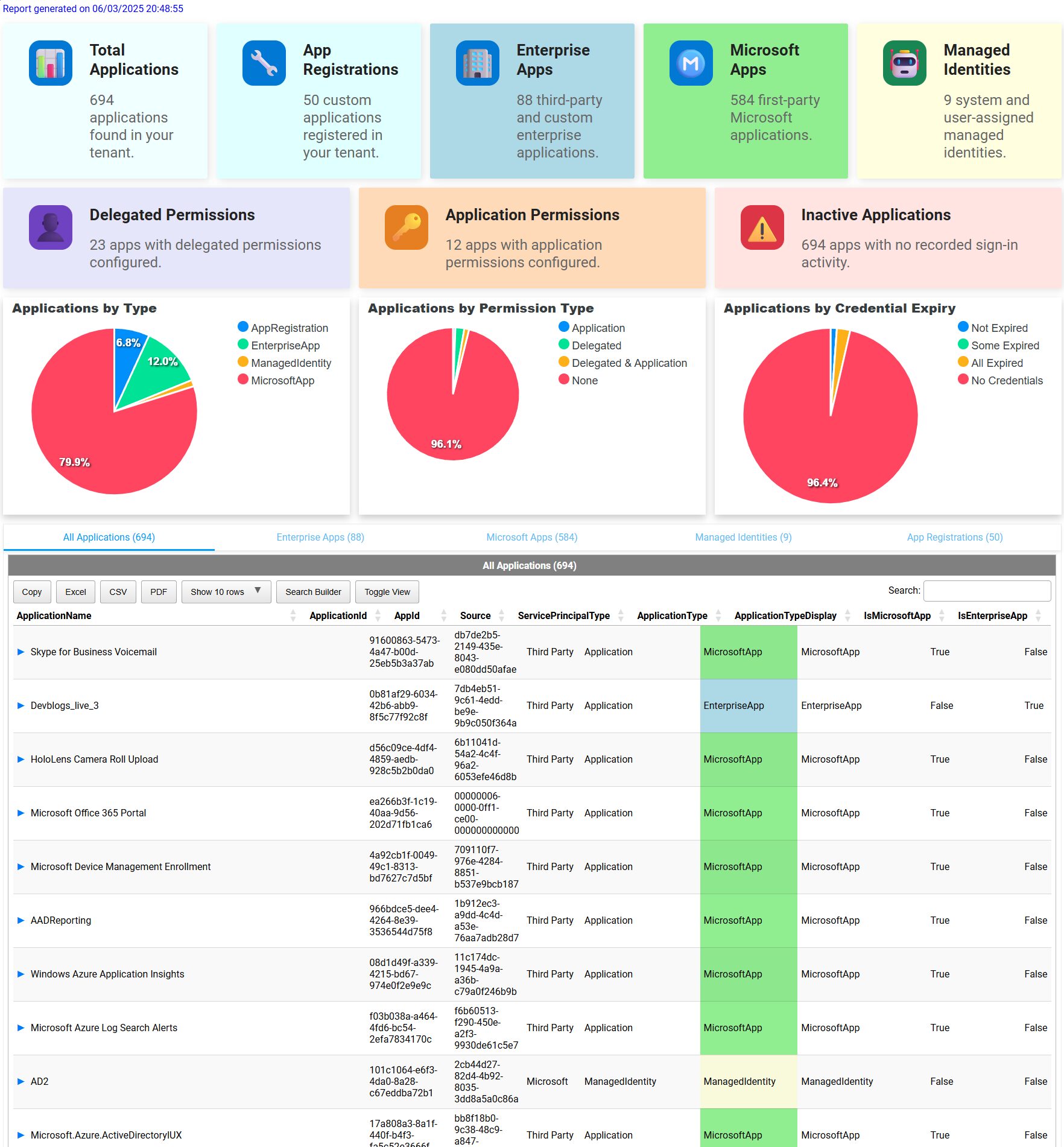
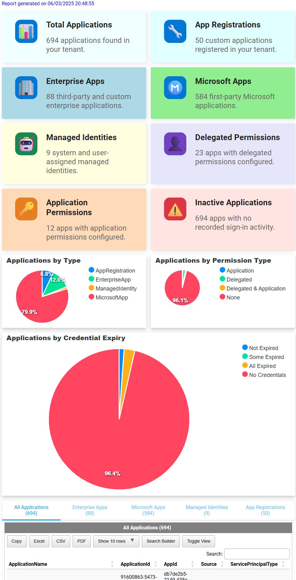
Creating intuitive, visually appealing HTML reports or dashboards can significantly enhance readability and usability. Today, I'm introducing several powerful additions to the PSWriteHTML PowerShell module:
New-HTMLInfoCard- Improved
New-HTMLSection,New-HTMLPanel, andNew-HTMLContainer - A versatile
-Densityparameter for flexible layout management - Rich shadow customization
Let's dive into each feature, with practical examples and screenshots, helping you quickly integrate these into your workflows.
💡 New-HTMLInfoCard – Clear and Informative Cards
New-HTMLInfoCard is perfect for displaying key metrics or summaries clearly and attractively. It supports:
- Icons (emoji, predefined sets, FontAwesome 500+ icons)
- Customizable colors
- Rich shadow effects
- Multiple styles (Standard, Compact, Classic, NoIcon)
Here's an example showing how New-HTMLInfoCard is used in different ways to show data
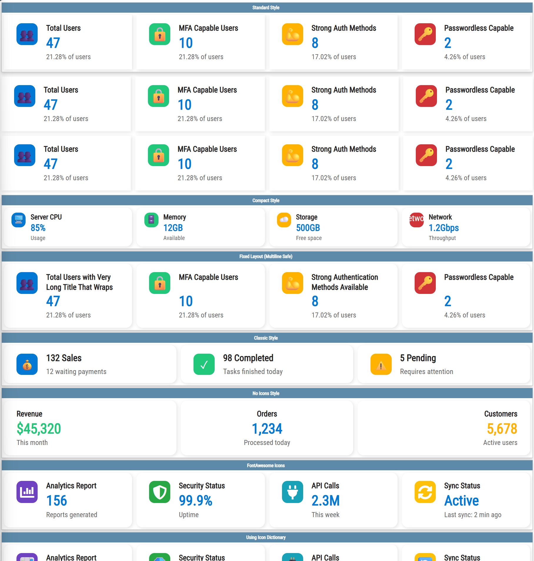
This nice looking infocard examples are done using single line of code New-HTMLInfoCard
New-HTML {
    New-HTMLPanelOption -BorderRadius 0px
    New-HTMLSectionOption -BorderRadius 0px -HeaderBackGroundColor AirForceBlue

    # Standard Style Cards
    New-HTMLSection -HeaderText "Standard Style" {
        New-HTMLSection -Invisible {
            New-HTMLInfoCard -Title "Total Users" -Number 47 -Subtitle "21.28% of users" -Icon "👥" -IconColor "#0078d4" -BorderRadius 0px
            New-HTMLInfoCard -Title "MFA Capable Users" -Number 10 -Subtitle "21.28% of users" -Icon "🔒" -IconColor "#21c87a" -BorderRadius 0px
            New-HTMLInfoCard -Title "Strong Auth Methods" -Number 8 -Subtitle "17.02% of users" -Icon "💪" -IconColor "#ffb300" -BorderRadius 0px
            New-HTMLInfoCard -Title "Passwordless Capable" -Number 2 -Subtitle "4.26% of users" -Icon "🔑" -IconColor "#d13438" -BorderRadius 0px
        }
    }

    New-HTMLSection -Density Compact -Invisible {
        New-HTMLInfoCard -Title "Total Users" -Number 47 -Subtitle "21.28% of users" -Icon "👥" -IconColor "#0078d4" -BorderRadius 0px
        New-HTMLInfoCard -Title "MFA Capable Users" -Number 10 -Subtitle "21.28% of users" -Icon "🔒" -IconColor "#21c87a" -BorderRadius 0px
        New-HTMLInfoCard -Title "Strong Auth Methods" -Number 8 -Subtitle "17.02% of users" -Icon "💪" -IconColor "#ffb300" -BorderRadius 0px
        New-HTMLInfoCard -Title "Passwordless Capable" -Number 2 -Subtitle "4.26% of users" -Icon "🔑" -IconColor "#d13438" -BorderRadius 0px
    }

    New-HTMLSection -Invisible {
        New-HTMLInfoCard -Title "Total Users" -Number 47 -Subtitle "21.28% of users" -Icon "👥" -IconColor "#0078d4" -BorderRadius 0px
        New-HTMLInfoCard -Title "MFA Capable Users" -Number 10 -Subtitle "21.28% of users" -Icon "🔒" -IconColor "#21c87a" -BorderRadius 0px
        New-HTMLInfoCard -Title "Strong Auth Methods" -Number 8 -Subtitle "17.02% of users" -Icon "💪" -IconColor "#ffb300" -BorderRadius 0px
        New-HTMLInfoCard -Title "Passwordless Capable" -Number 2 -Subtitle "4.26% of users" -Icon "🔑" -IconColor "#d13438" -BorderRadius 0px
    }

    # Compact Style Cards
    New-HTMLSection -HeaderText "Compact Style" {
        New-HTMLSection -Invisible {
            New-HTMLInfoCard -Title "Server CPU" -Number "85%" -Subtitle "Usage" -Icon "Server" -IconColor "#0078d4" -Style "Compact"
            New-HTMLInfoCard -Title "Memory" -Number "12GB" -Subtitle "Available" -Icon "Database" -IconColor "#21c87a" -Style "Compact"
            New-HTMLInfoCard -Title "Storage" -Number "500GB" -Subtitle "Free space" -Icon "Cloud" -IconColor "#ffb300" -Style "Compact"
            New-HTMLInfoCard -Title "Network" -Number "1.2Gbps" -Subtitle "Throughput" -Icon "Network" -IconColor "#d13438" -Style "Compact"
        }
    }

    # Fixed Layout Style (Multiline Safe)
    New-HTMLSection -HeaderText "Fixed Layout (Multiline Safe)" {
        New-HTMLSection -Invisible {
            New-HTMLInfoCard -Title "Total Users with Very Long Title That Wraps" -Number 47 -Subtitle "21.28% of users" -Icon "Users" -IconColor "#0078d4" -Style "Fixed"
            New-HTMLInfoCard -Title "MFA Capable Users" -Number 10 -Subtitle "21.28% of users" -Icon "Lock" -IconColor "#21c87a" -Style "Fixed"
            New-HTMLInfoCard -Title "Strong Authentication Methods Available" -Number 8 -Subtitle "17.02% of users" -Icon "💪" -IconColor "#ffb300" -Style "Fixed"
            New-HTMLInfoCard -Title "Passwordless Capable" -Number 2 -Subtitle "4.26% of users" -Icon "Key" -IconColor "#d13438" -Style "Fixed"
        }
    }

    # Classic Style Cards
    New-HTMLSection -HeaderText "Classic Style" {
        New-HTMLSection -Invisible {
            New-HTMLInfoCard -Title "132 Sales" -Subtitle "12 waiting payments" -Icon Money -IconColor "#0078d4" -Style "Classic"
            New-HTMLInfoCard -Title "98 Completed" -Subtitle "Tasks finished today" -Icon "Check" -IconColor "#21c87a" -Style "Classic"
            New-HTMLInfoCard -Title "5 Pending" -Subtitle "Requires attention" -Icon "Warning" -IconColor "#ffb300" -Style "Classic"
        }
    }

    # No Icon Style Cards
    New-HTMLSection -HeaderText "No Icons Style" {
        New-HTMLSection -Invisible {
            New-HTMLInfoCard -Title "Revenue" -Number "`$45,320" -Subtitle "This month" -Style "NoIcon" -NumberColor "#21c87a" -Alignment "Left"
            New-HTMLInfoCard -Title "Orders" -Number "1,234" -Subtitle "Processed today" -Style "NoIcon" -NumberColor "#0078d4" -Alignment "Center"
            New-HTMLInfoCard -Title "Customers" -Number "5,678" -Subtitle "Active users" -Style "NoIcon" -NumberColor "#ffb300" -Alignment "Right"
        }
    }

    # Using FontAwesome Icons
    New-HTMLSection -HeaderText "FontAwesome Icons" {
        New-HTMLSection -Invisible {
            New-HTMLInfoCard -Title "Analytics Report" -Number 156 -Subtitle "Reports generated" -IconSolid "chart-bar" -IconColor "#6f42c1"
            New-HTMLInfoCard -Title "Security Status" -Number "99.9%" -Subtitle "Uptime" -IconSolid "shield-alt" -IconColor "#28a745"
            New-HTMLInfoCard -Title "API Calls" -Number "2.3M" -Subtitle "This week" -IconSolid "plug" -IconColor "#17a2b8"
            New-HTMLInfoCard -Title "Sync Status" -Number "Active" -Subtitle "Last sync: 2 min ago" -IconSolid "sync-alt" -IconColor "#ffc107"
        }
    }

    # Using Icon Dictionary
    New-HTMLSection -HeaderText "Using Icon Dictionary" {
        New-HTMLSection -Invisible {
            New-HTMLInfoCard -Title "Analytics Report" -Number 156 -Subtitle "Reports generated" -Icon "Chart" -IconColor "#6f42c1"
            New-HTMLInfoCard -Title "Security Status" -Number "99.9%" -Subtitle "Uptime" -Icon "Shield" -IconColor "#28a745"
            New-HTMLInfoCard -Title "API Calls" -Number "2.3M" -Subtitle "This week" -Icon "Api" -IconColor "#17a2b8"
            New-HTMLInfoCard -Title "Sync Status" -Number "Active" -Subtitle "Last sync: 2 min ago" -Icon "Sync" -IconColor "#ffc107"
        }
    }

    # Alignment Examples
    New-HTMLSection -HeaderText "Alignment Examples" {
        New-HTMLSection -Invisible {
            New-HTMLInfoCard -Title "Left Aligned" -Number "Default" -Subtitle "Standard alignment" -Icon "📊" -IconColor "#6f42c1" -Alignment "Left"
            New-HTMLInfoCard -Title "Center Aligned" -Number "Centered" -Subtitle "Perfect for dashboards" -Icon "⚖️" -IconColor "#28a745" -Alignment "Center"
            New-HTMLInfoCard -Title "Right Aligned" -Number "Right Side" -Subtitle "Alternative layout" -Icon "➡️" -IconColor "#17a2b8" -Alignment "Right"
        }
    }

    # Color Customization Examples
    New-HTMLSection -HeaderText "Color Customization" {
        New-HTMLSection -Invisible {
            New-HTMLInfoCard -Title "Custom Colors" -Number "Beautiful" -Subtitle "Title, Number & Subtitle colors" -Icon "🎨" -IconColor "#e74c3c" -TitleColor "#2c3e50" -NumberColor "#e74c3c" -SubtitleColor "#7f8c8d" -BorderRadius 0px
            New-HTMLInfoCard -Title "Shadow Effects" -Number "Amazing" -Subtitle "Custom shadow colors" -Icon "✨" -IconColor "#f39c12" -ShadowColor "rgba(243, 156, 18, 0.3)" -ShadowDirection "All" -BorderRadius 0px
            New-HTMLInfoCard -Title "Directional Shadow" -Number "Right Side" -Subtitle "Shadow to the right" -Icon "➡️" -IconColor "#9b59b6" -ShadowDirection "Right" -ShadowColor "rgba(155, 89, 182, 0.4)" -BorderRadius 0px
        }
    }
} -FilePath "$PSScriptRoot\Example-InfoCard.html" -Online -Show
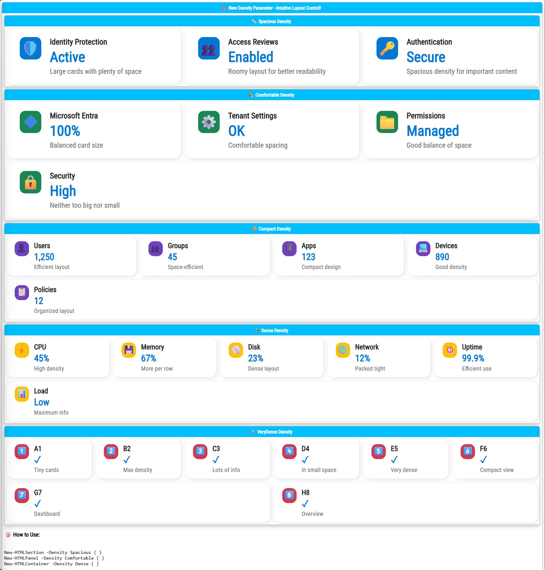
💡 Introducing Density Parameter
For this feature to be even better I've introduced the new -Density parameter lets you precisely control the layout density of your dashboards. Available options:
- Spacious: Larger cards, plenty of whitespace, ideal for clarity
- Comfortable: Balanced spacing, great for general use
- Compact: Optimized space for detailed views
- Dense: Tightly packed layout for maximum data display
- VeryDense: Minimal space, ideal for extensive metrics
Example:
New-HTML {
    New-HTMLSection -HeaderText "🎯 New Density Parameter - Intuitive Layout Control!" -Wrap wrap {
        New-HTMLSection -HeaderText "📏 Spacious Density" -Density Spacious {
            New-HTMLInfoCard -Title "Identity Protection" -Number "Active" -Subtitle "Large cards with plenty of space" -Icon "🛡️" -IconColor '#0078d4'
            New-HTMLInfoCard -Title "Access Reviews" -Number "Enabled" -Subtitle "Roomy layout for better readability" -Icon "👥" -IconColor '#0078d4'
            New-HTMLInfoCard -Title "Authentication" -Number "Secure" -Subtitle "Spacious density for important content" -Icon "🔑" -IconColor '#0078d4'
        }

        New-HTMLSection -HeaderText "🏠 Comfortable Density" -Density Comfortable {
            New-HTMLInfoCard -Title "Microsoft Entra" -Number "100%" -Subtitle "Balanced card size" -Icon "🔷" -IconColor '#198754'
            New-HTMLInfoCard -Title "Tenant Settings" -Number "OK" -Subtitle "Comfortable spacing" -Icon "⚙️" -IconColor '#198754'
            New-HTMLInfoCard -Title "Permissions" -Number "Managed" -Subtitle "Good balance of space" -Icon "📁" -IconColor '#198754'
            New-HTMLInfoCard -Title "Security" -Number "High" -Subtitle "Neither too big nor small" -Icon "🔒" -IconColor '#198754'
        }

        New-HTMLSection -HeaderText "📦 Compact Density" -Density Compact {
            New-HTMLInfoCard -Title "Users" -Number "1,250" -Subtitle "Efficient layout" -Icon "👤" -IconColor '#6f42c1' -Style "Compact"
            New-HTMLInfoCard -Title "Groups" -Number "45" -Subtitle "Space-efficient" -Icon "👥" -IconColor '#6f42c1' -Style "Compact"
            New-HTMLInfoCard -Title "Apps" -Number "123" -Subtitle "Compact design" -Icon "📱" -IconColor '#6f42c1' -Style "Compact"
            New-HTMLInfoCard -Title "Devices" -Number "890" -Subtitle "Good density" -Icon "💻" -IconColor '#6f42c1' -Style "Compact"
            New-HTMLInfoCard -Title "Policies" -Number "12" -Subtitle "Organized layout" -Icon "📋" -IconColor '#6f42c1' -Style "Compact"
        }

        New-HTMLSection -HeaderText "🏗️ Dense Density" -Density Dense {
            New-HTMLInfoCard -Title "CPU" -Number "45%" -Subtitle "High density" -Icon "⚡" -IconColor '#ffc107' -Style "Compact"
            New-HTMLInfoCard -Title "Memory" -Number "67%" -Subtitle "More per row" -Icon "💾" -IconColor '#ffc107' -Style "Compact"
            New-HTMLInfoCard -Title "Disk" -Number "23%" -Subtitle "Dense layout" -Icon "💿" -IconColor '#ffc107' -Style "Compact"
            New-HTMLInfoCard -Title "Network" -Number "12%" -Subtitle "Packed tight" -Icon "🌐" -IconColor '#ffc107' -Style "Compact"
            New-HTMLInfoCard -Title "Uptime" -Number "99.9%" -Subtitle "Efficient use" -Icon "⏰" -IconColor '#ffc107' -Style "Compact"
            New-HTMLInfoCard -Title "Load" -Number "Low" -Subtitle "Maximum info" -Icon "📊" -IconColor '#ffc107' -Style "Compact"
        }

        New-HTMLSection -HeaderText "🔬 VeryDense Density" -Density VeryDense {
            New-HTMLInfoCard -Title "A1" -Number "✓" -Subtitle "Tiny cards" -Icon "1️⃣" -IconColor '#dc3545' -Style "Compact"
            New-HTMLInfoCard -Title "B2" -Number "✓" -Subtitle "Max density" -Icon "2️⃣" -IconColor '#dc3545' -Style "Compact"
            New-HTMLInfoCard -Title "C3" -Number "✓" -Subtitle "Lots of info" -Icon "3️⃣" -IconColor '#dc3545' -Style "Compact"
            New-HTMLInfoCard -Title "D4" -Number "✓" -Subtitle "In small space" -Icon "4️⃣" -IconColor '#dc3545' -Style "Compact"
            New-HTMLInfoCard -Title "E5" -Number "✓" -Subtitle "Very dense" -Icon "5️⃣" -IconColor '#dc3545' -Style "Compact"
            New-HTMLInfoCard -Title "F6" -Number "✓" -Subtitle "Compact view" -Icon "6️⃣" -IconColor '#dc3545' -Style "Compact"
            New-HTMLInfoCard -Title "G7" -Number "✓" -Subtitle "Dashboard" -Icon "7️⃣" -IconColor '#dc3545' -Style "Compact"
            New-HTMLInfoCard -Title "H8" -Number "✓" -Subtitle "Overview" -Icon "8️⃣" -IconColor '#dc3545' -Style "Compact"
        }

        New-HTMLText -Text @"
<h3>📝 How to Use:</h3>
<pre><code>
New-HTMLSection -Density Spacious { }
New-HTMLPanel -Density Comfortable { }
New-HTMLContainer -Density Dense { }</code></pre>

<p><strong>🎯 Perfect!</strong> Now the parameter name matches what it does - control the density/spacing of your layout!</p>
<p><em>Resize your browser window to see responsive behavior in action.</em></p>
"@ -Color Black
    }
} -FilePath "$PSScriptRoot\Example-DensityTest.html" -TitleText "Density Parameter Demo" -Online -Show
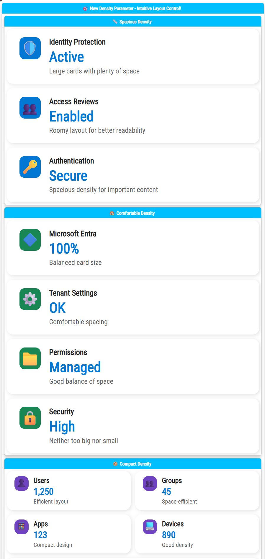
Once you resize your browser you will see the cards adapt, maximizing readability across all devices.
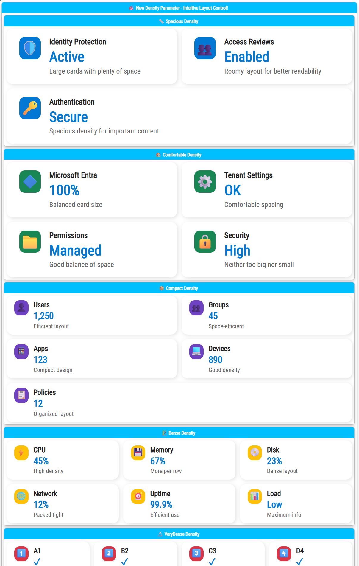
Further resizing changes how the cards look like based on the density settings
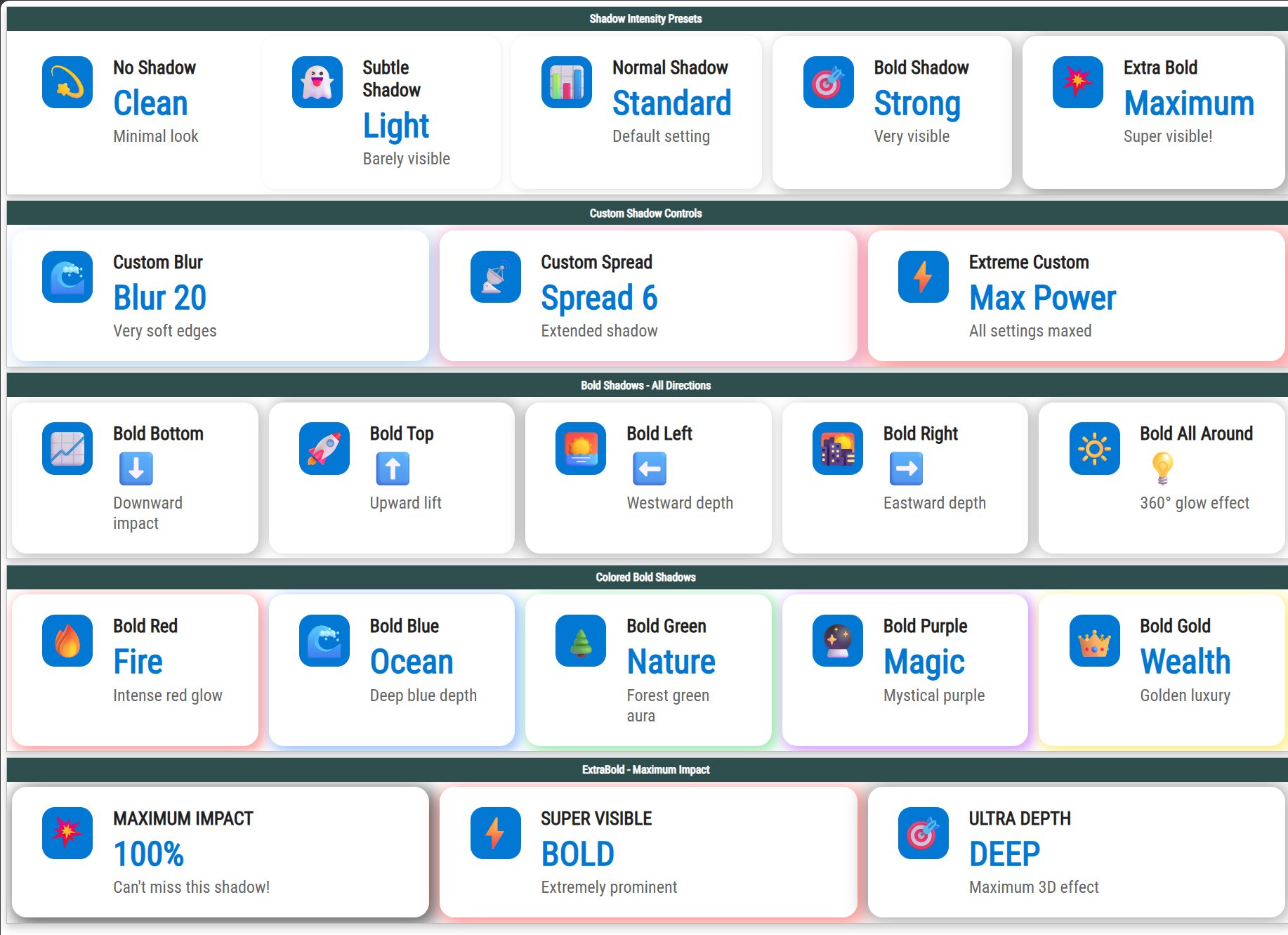
💡 Advanced Shadow Customization
If you want to make the cards/dashboards your own – Shadows can significantly enhance visual presentation. You can customize shadows with:
- Intensity presets: None, Subtle, Normal, Bold, ExtraBold
- Directional shadows: Top, Bottom, Left, Right, All
- Custom blur and spread
- Custom color overlays
Example:
New-HTML {
    New-HTMLSectionStyle -BorderRadius 0px -HeaderBackGroundColor 'DarkSlateGray'

    # Shadow Intensity Presets Section
    New-HTMLSection -HeaderText 'Shadow Intensity Presets'  {
        New-HTMLSection -Invisible  {
            # None - No shadow
            New-HTMLInfoCard -Title "No Shadow" -Number "Clean" -Subtitle "Minimal look" -Icon "💫" -ShadowIntensity 'None'

            # Subtle - Very light shadow
            New-HTMLInfoCard -Title "Subtle Shadow" -Number "Light" -Subtitle "Barely visible" -Icon "👻" -ShadowIntensity 'Subtle'

            # Normal - Standard shadow (default)
            New-HTMLInfoCard -Title "Normal Shadow" -Number "Standard" -Subtitle "Default setting" -Icon "📊" -ShadowIntensity 'Normal'

            # Bold - Strong, very visible shadow
            New-HTMLInfoCard -Title "Bold Shadow" -Number "Strong" -Subtitle "Very visible" -Icon "🎯" -ShadowIntensity 'Bold'

            # ExtraBold - Maximum impact shadow
            New-HTMLInfoCard -Title "Extra Bold" -Number "Maximum" -Subtitle "Super visible!" -Icon "💥" -ShadowIntensity 'ExtraBold'
        }
    }

    # Custom Shadow Controls Section
    New-HTMLSection -HeaderText 'Custom Shadow Controls' {
        New-HTMLSection -Invisible {
            # Custom blur radius
            New-HTMLInfoCard -Title "Custom Blur" -Number "Blur 20" -Subtitle "Very soft edges" -Icon "🌊" -ShadowIntensity 'Custom' -ShadowBlur 20 -ShadowColor 'rgba(0, 100, 200, 0.3)'

            # Custom spread
            New-HTMLInfoCard -Title "Custom Spread" -Number "Spread 6" -Subtitle "Extended shadow" -Icon "📡" -ShadowIntensity 'Custom' -ShadowBlur 12 -ShadowSpread 6 -ShadowColor 'rgba(200, 0, 100, 0.25)'

            # Extreme custom settings
            New-HTMLInfoCard -Title "Extreme Custom" -Number "Max Power" -Subtitle "All settings maxed" -Icon "⚡" -ShadowIntensity 'Custom' -ShadowBlur 25 -ShadowSpread 8 -ShadowColor 'rgba(255, 0, 0, 0.4)'
        }
    }

    # Bold Shadows with Different Directions
    New-HTMLSection -HeaderText 'Bold Shadows - All Directions' {
        New-HTMLSection -Invisible {
            New-HTMLInfoCard -Title "Bold Bottom" -Number "⬇️" -Subtitle "Downward impact" -Icon "📈" -ShadowIntensity 'Bold' -ShadowDirection 'Bottom'
            New-HTMLInfoCard -Title "Bold Top" -Number "⬆️" -Subtitle "Upward lift" -Icon "🚀" -ShadowIntensity 'Bold' -ShadowDirection 'Top'
            New-HTMLInfoCard -Title "Bold Left" -Number "⬅️" -Subtitle "Westward depth" -Icon "🌅" -ShadowIntensity 'Bold' -ShadowDirection 'Left'
            New-HTMLInfoCard -Title "Bold Right" -Number "➡️" -Subtitle "Eastward depth" -Icon "🌇" -ShadowIntensity 'Bold' -ShadowDirection 'Right'
            New-HTMLInfoCard -Title "Bold All Around" -Number "💡" -Subtitle "360° glow effect" -Icon "🔆" -ShadowIntensity 'Bold' -ShadowDirection 'All'
        }
    }

    # Colored Bold Shadows
    New-HTMLSection -HeaderText 'Colored Bold Shadows' {
        New-HTMLSection -Invisible {
            # Bold red shadow
            New-HTMLInfoCard -Title "Bold Red" -Number "Fire" -Subtitle "Intense red glow" -Icon "🔥" -ShadowIntensity 'Bold' -ShadowColor 'rgba(255, 0, 0, 0.4)'

            # Bold blue shadow
            New-HTMLInfoCard -Title "Bold Blue" -Number "Ocean" -Subtitle "Deep blue depth" -Icon "🌊" -ShadowIntensity 'Bold' -ShadowColor 'rgba(0, 100, 255, 0.4)'

            # Bold green shadow
            New-HTMLInfoCard -Title "Bold Green" -Number "Nature" -Subtitle "Forest green aura" -Icon "🌲" -ShadowIntensity 'Bold' -ShadowColor 'rgba(0, 200, 50, 0.4)'

            # Bold purple shadow
            New-HTMLInfoCard -Title "Bold Purple" -Number "Magic" -Subtitle "Mystical purple" -Icon "🔮" -ShadowIntensity 'Bold' -ShadowColor 'rgba(150, 0, 255, 0.4)'

            # Bold gold shadow
            New-HTMLInfoCard -Title "Bold Gold" -Number "Wealth" -Subtitle "Golden luxury" -Icon "👑" -ShadowIntensity 'Bold' -ShadowColor 'rgba(255, 215, 0, 0.5)'
        }
    }

    # ExtraBold Showcase
    New-HTMLSection -HeaderText 'ExtraBold - Maximum Impact' {
        New-HTMLSection -Invisible {
            New-HTMLInfoCard -Title "MAXIMUM IMPACT" -Number "100%" -Subtitle "Can't miss this shadow!" -Icon "💥" -ShadowIntensity 'ExtraBold' -ShadowColor 'rgba(0, 0, 0, 0.6)'
            New-HTMLInfoCard -Title "SUPER VISIBLE" -Number "BOLD" -Subtitle "Extremely prominent" -Icon "⚡" -ShadowIntensity 'ExtraBold' -ShadowColor 'rgba(255, 50, 50, 0.5)'
            New-HTMLInfoCard -Title "ULTRA DEPTH" -Number "DEEP" -Subtitle "Maximum 3D effect" -Icon "🎯" -ShadowIntensity 'ExtraBold' -ShadowDirection 'All'
        }
    }

} -FilePath "$PSScriptRoot\Example-InfoCard-ShadowShowcase.html" -TitleText "InfoCard Shadow Showcase" -Online -Show
💡 Other features mixed up
Here's another example that shows couple of info cards in action, along with older features such as New-HTMLSectionStyle, New-HTMLImage, and New-HTMLDate.
And the code for that nice example:
New-HTML {
    New-HTMLHeader {
        New-HTMLSection -Invisible {
            New-HTMLPanel -Invisible {
                New-HTMLImage -Source 'https://evotec.pl/wp-content/uploads/2015/05/Logo-evotec-012.png' -UrlLink 'https://evotec.pl/' -AlternativeText 'My other text' -Class 'otehr' -Width '50%'
            }
            New-HTMLPanel -Invisible {
                New-HTMLImage -Source 'https://evotec.pl/wp-content/uploads/2015/05/Logo-evotec-012.png' -UrlLink 'https://evotec.pl/' -AlternativeText 'My other text' -Width '20%'
            } -AlignContentText right
        }
        New-HTMLPanel {
            New-HTMLText -Text "Report generated on ", (New-HTMLDate -InputDate (Get-Date)) -Color None, Blue -FontSize 10, 10
            New-HTMLText -Text "Report generated on ", (New-HTMLDate -InputDate (Get-Date -Year 2022)) -Color None, Blue -FontSize 10, 10
            New-HTMLText -Text "Report generated on ", (New-HTMLDate -InputDate (Get-Date -Year 2022) -DoNotIncludeFromNow) -Color None, Blue -FontSize 10, 10
            New-HTMLText -Text "Report generated on ", (New-HTMLDate -InputDate (Get-Date -Year 2024 -Month 11)) -Color None, Blue -FontSize 10, 10
        } -Invisible -AlignContentText right
    }
    New-HTMLSectionStyle -BorderRadius 0px -HeaderBackGroundColor '#0078d4'

    # Feature highlights section - now with ResponsiveWrap
    New-HTMLSection -Density Dense {
        # Identity Protection
        New-HTMLInfoCard -Title "Identity Protection" -Subtitle "View risky users, risky workload identities, and risky sign-ins in your tenant." -Icon "🛡️" -IconColor "#0078d4" -Style "Standard" -ShadowIntensity 'Normal' -BorderRadius 2px -BackgroundColor Azure

        # # Access reviews
        New-HTMLInfoCard -Title "Access reviews" -Subtitle "Make sure only the right people have continued access." -Icon "👥" -IconColor "#0078d4" -Style "Standard" -ShadowIntensity 'Normal' -BorderRadius 2px -BackgroundColor Salmon

        # # Authentication methods
        New-HTMLInfoCard -Title "Authentication methods" -Subtitle "Configure your users in the authentication methods policy to enable passwordless authentication." -Icon "🔑" -IconColor "#0078d4" -Style "Standard" -ShadowIntensity 'Normal' -BorderRadius 2px -ShadowColor Salmon

        # # Microsoft Entra Domain Services
        New-HTMLInfoCard -Title "Microsoft Entra Domain Services" -Subtitle "Lift-and-shift legacy applications running on-premises into Azure." -Icon "🔷" -IconColor "#0078d4" -Style "Standard" -ShadowIntensity 'Normal' -BorderRadius 2px

        # # Tenant restrictions
        New-HTMLInfoCard -Title "Tenant restrictions" -Subtitle "Specify the list of tenants that their users are permitted to access." -Icon "🚫" -IconColor "#dc3545" -Style "Standard" -ShadowIntensity 'Normal' -BorderRadius 2px

        # # Entra Permissions Management
        New-HTMLInfoCard -Title "Entra Permissions Management" -Subtitle "Continuous protection of your critical cloud resources from accidental misuse and malicious exploitation of permissions." -Icon "📁" -IconColor "#198754" -Style "Standard" -ShadowIntensity 'Normal' -BorderRadius 2px

        # # Privileged Identity Management
        New-HTMLInfoCard -Title "Privileged Identity Management" -Subtitle "Manage, control, and monitor access to important resources in your organization." -Icon "💎" -IconColor "#6f42c1" -Style "Standard" -ShadowIntensity 'Normal' -BorderRadius 2px

        # Conditional Access
        New-HTMLInfoCard -Title "Conditional Access" -Subtitle "Control user access based on Conditional Access policy to bring signals together, to make decisions, and enforce organizational policies." -Icon "🔒" -IconColor "#0078d4" -Style "Standard" -ShadowIntensity 'Normal' -BorderRadius 2px

        # Conditional Access
        New-HTMLInfoCard -Title "Conditional Access" -Subtitle "Control user access based on Conditional Access policy to bring signals together, to make decisions, and enforce organizational policies." -IconSolid running -IconColor RedBerry -Style "Standard" -ShadowIntensity 'Normal' -BorderRadius 2px
    }


    # Additional services section
    New-HTMLSection -HeaderText 'Additional Services' {
        New-HTMLSection -Density Spacious {
            # Try Microsoft Entra admin center
            New-HTMLInfoCard -Title "Try Microsoft Entra admin center" -Subtitle "Secure your identity environment with Microsoft Entra ID, permissions management and more." -Icon "🔧" -IconColor "#0078d4" -Style "Standard" -ShadowIntensity 'Normal' -BorderRadius 2px

            # User Profile Card
            New-HTMLInfoCard -Title "Przemysław Klys" -Subtitle "e6a8f1cf-0874-4323-a12f-2bf51bb6dfdd | Global Administrator and 2 other roles" -Icon "👤" -IconColor "#6c757d" -Style "Standard" -ShadowIntensity 'Normal' -BorderRadius 2px

            # Secure Score
            New-HTMLInfoCard -Title "Secure Score for Identity" -Number "28.21%" -Subtitle "Secure score updates can take up to 48 hours." -Icon "🏆" -IconColor "#ffc107" -Style "Standard" -ShadowIntensity 'Normal' -BorderRadius 2px

            # Microsoft Entra Connect
            New-HTMLInfoCard -Title "Microsoft Entra Connect" -Number "✅ Enabled" -Subtitle "Last sync was less than 1 hour ago" -Icon "🔄" -IconColor "#198754" -Style "Standard" -ShadowIntensity 'Normal' -BorderRadius 2px
        }
    }

    # Enhanced styling showcase with different shadow intensities
    New-HTMLSection -HeaderText 'Enhanced Visual Showcase' {
        New-HTMLSection -Density Spacious {
            # ExtraNormal shadows for high-priority items
            New-HTMLInfoCard -Title "HIGH PRIORITY" -Number "Critical" -Subtitle "Maximum visibility shadow" -Icon "⚠️" -IconColor "#dc3545" -ShadowIntensity 'Normal' -ShadowColor 'rgba(220, 53, 69, 0.4)' -BorderRadius 2px

            # Normal colored shadows
            New-HTMLInfoCard -Title "Security Alert" -Number "Active" -Subtitle "Normal red shadow for attention" -Icon "🔴" -IconColor "#dc3545" -ShadowIntensity 'Normal' -ShadowColor 'rgba(220, 53, 69, 0.3)' -BorderRadius 2px

            # Normal with custom color
            New-HTMLInfoCard -Title "Performance" -Number "Good" -Subtitle "Green shadow indicates success" -Icon "✅" -IconColor "#198754" -ShadowIntensity 'Normal' -ShadowColor 'rgba(25, 135, 84, 0.3)' -BorderRadius 2px

            # Custom shadow settings
            New-HTMLInfoCard -Title "Custom Styling" -Number "Advanced" -Subtitle "Custom blur and spread values" -Icon "🎨" -IconColor "#6f42c1" -ShadowIntensity 'Custom' -ShadowBlur 15 -ShadowSpread 3 -ShadowColor 'rgba(111, 66, 193, 0.25)' -BorderRadius 2px
        }
    }

} -FilePath "$PSScriptRoot\Example-MicrosoftEntra.html" -TitleText "Microsoft Entra Interface Recreation" -Online -Show
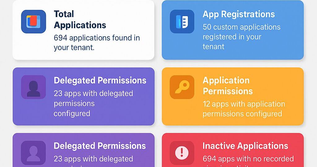
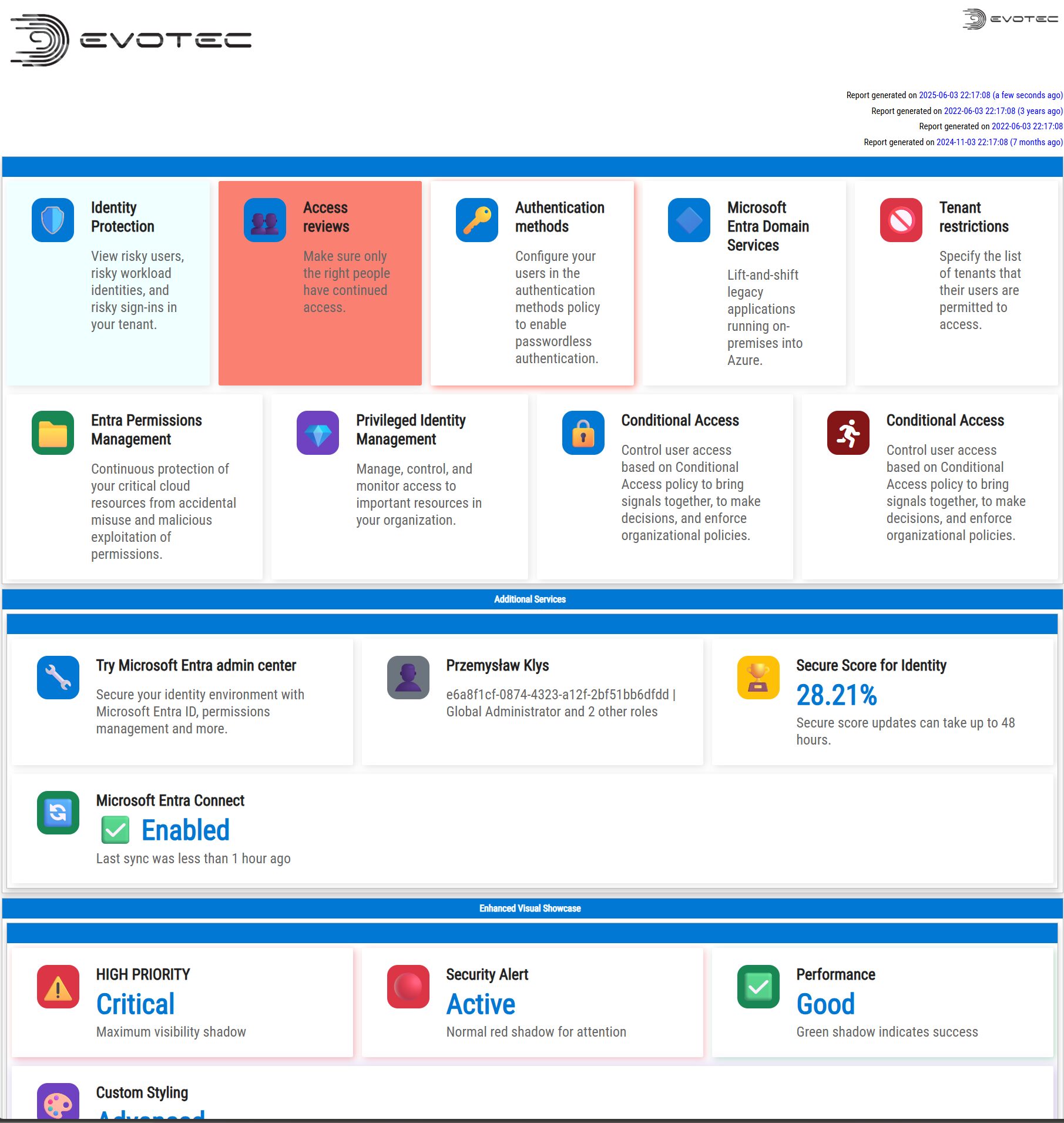
💡 Real-world Dashboard Use
Consider a practical dashboard showing Microsoft Entra details with enhanced visuals and layout control from my module GraphEssentials
Once you make the window smaller, or larger the sections content will shift one way or another
💡 Wrap-up
These new additions to PSWriteHTML greatly enhance your ability to create professional-grade HTML reports. All functionalities are intuitive, customizable, and aimed at saving time.
Explore further by updating your PSWriteHTML module and incorporating these features into your dashboards today. Share your experiences and feedback!
For more detailed examples and code snippets, check the PSWriteHTML GitHub repository.
💡 Installing or updating PowerShell module
PSWriteHTML is available in PowerShellGallery as an easy-to-use download.
Install-Module PSWriteHTML -Force -Verbose
Once the module is installed, just copy/paste examples and you're ready to go.
PS. Remember to save the file before running when using $PSScriptRoot or replace it with full path to make sure file has place to save.